After building a new feature or product, building out onboarding can feel like doing the dishes after a feast: You did the fun stuff—now it's time for the chores.
Imagine this:
Your company has spent months building a fancy new feature, the marketing team is cramming hot leads onto the landing page, servers are melting, but despite that, no one is signing up and using your product.
Boss enters the chat.
Before you duck for cover and drum up excuses, consider taking a hot minute to read this post. Bookmark it for later too if you want to come back to it!
It takes more than functionality and dreamy aesthetics to hit mass adoption by succeeding in onboarding users. You know what they say, if a new feature is built in the woods, does it make a sound?
Having a world class onboarding experience is the key to turning folks into power users and to avoiding fall-off after sign-up. By using in-app messaging like pop-ups, nudges, and product tours, you can ensure that user onboarding is a smooth and delightful experience. However, knowing how exactly to accomplish this this can be a challenge for even the most experienced product designers.
But fear not — you don’t have to do it alone!
We’ve compiled some of the best examples of pop-ups and nudges usage for user onboarding from a variety of software companies so that you can incorporate some of the best tactics into your own product!
In-App Messaging Concepts
Before we dive into our user onboarding examples, let’s briefly review the key in-app messaging concepts that can be employed during the user onboarding process.
As we detailed in our comprehensive guide on in-app messaging best practices for User Onboarding, all of the core styles can be used effectively in the right place, at the right time, for the right user:
- Modals: modals usually present as pop-ups which take over some or all of the screen to prompt an action. These are particularly popular at the inception of the user onboarding process because they are very direct and clear calls-to-action. They should really only be used for necessary actions, not just for building awareness of a new feature or for marketing announcements.
- Tooltips: tooltips are more targeted, and act as nudges towards specific behaviors. They encourage users to discover new features and functionality in a friendly and more discreet way than modals.
- Product Tours: product tours help guide new users through a series of action steps for popular use cases of the software. Sometimes they are very direct, or even required, and other times they can be nudges of encouragement towards ideal behavior patterns.
Pop-ups and nudges can both be powerful in-app messaging tactics when used correctly (yes, pop-ups can be used effectively and cleanly … though it pains me to say that!) Being user centric means understanding when and where to use these!
However, the reality is that often times product team’s rely on heavy and forceful pop-ups to direct user behavior, producing unsatisfactory UX, or, even worse, failed onboarding and activation.
Plus, we all have had nightmare experiences with spammy pop-ups which refuse to close, take over your screen, or otherwise ruin the UX. There is definitely a specific time and place for pop-up modals — that time and place is limited however!
Conversely, we will also show what happens to a user onboarding experience when an otherwise great software product fails to use any effective in-app messaging when onboarding users.
The Best User Onboarding Examples Using Pop-Ups and Nudges
Now, let’s dive in and take a look at some of these best in class examples at how thoughtful pop-ups and delightful in-app nudges can improve your user onboarding process and create your next wave of product evangelists!
How Make Combines Large Pop-Ups with Light Nudges For Success

Make is a popular software for businesses and individuals who want to automate workflows, save time, and create fast and dynamic user experiences. Originally known as Integromat, Make is one of the most popular software automation companies alongside giants like Zapier.
When a new user onboards into Make, they are prompted in the sign-up form to enter some demographic information and then are passed along to their home dashboard.
They are immediately greeted with a welcoming and colorful pop-up modal, which in a four-step click-through demonstrates how to create your first workflow, and also clarifies the verbiage that Make will use moving forward for these workflows (they call them “scenarios.”)
By itself, this pop up would fall short of the mark in its ability to educate a new user — it fails to be interactive and relies on a user to remember these steps.
Luckily, after you complete this four step pop up and close it out, you're immediately prompted with a nudge towards creating a new scenario (as they just showed you how to do in the pop-up!)
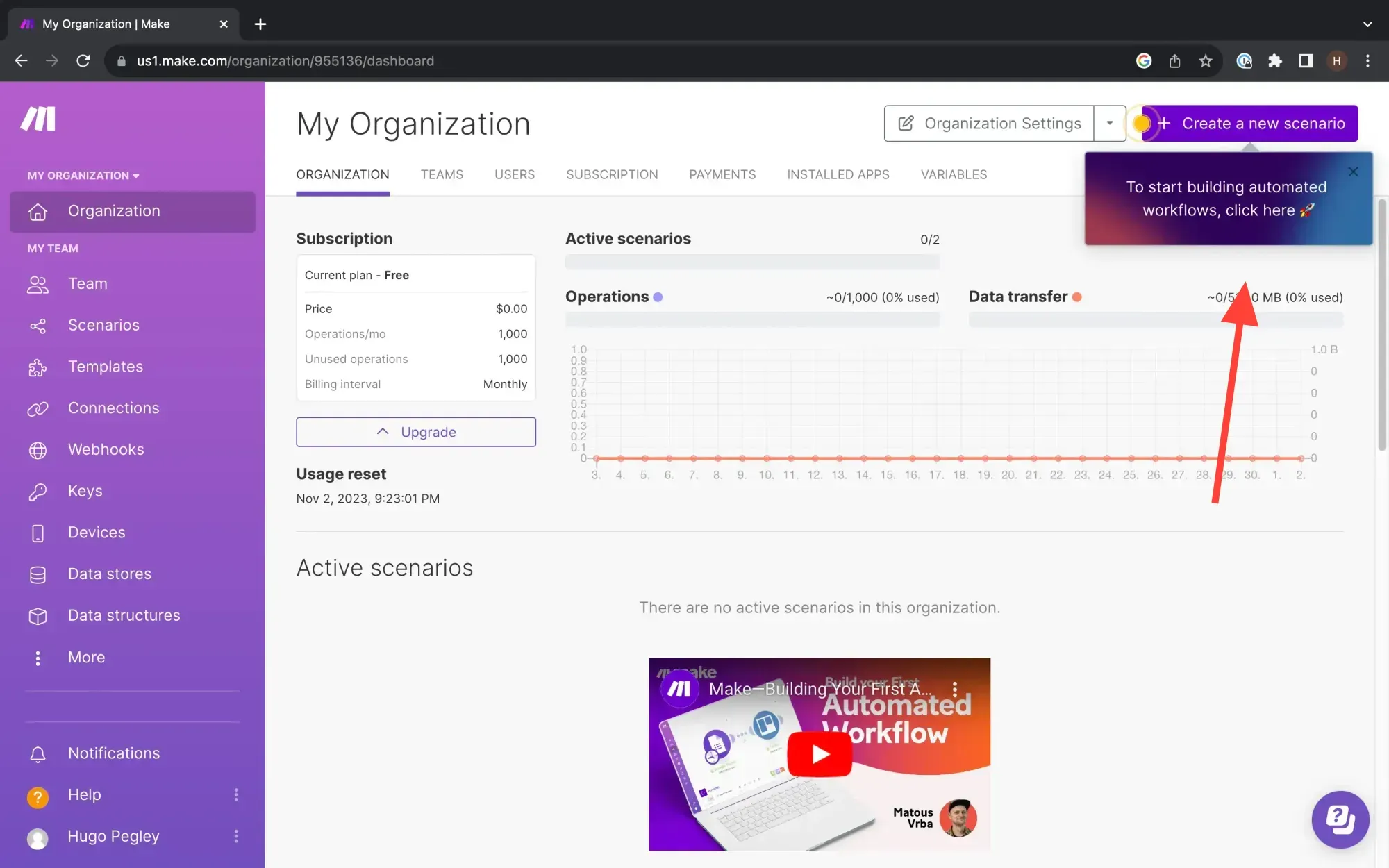
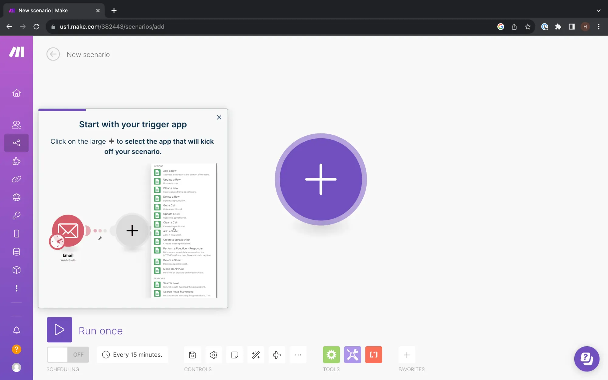
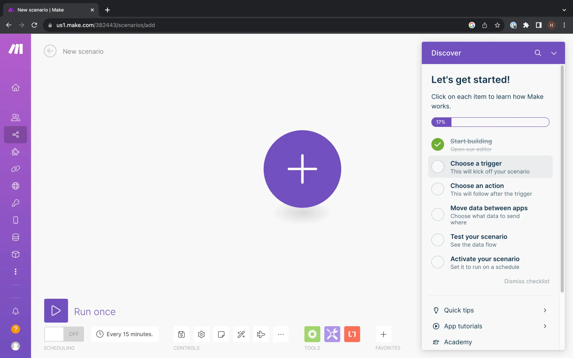
If you take this nudge, you're then brought into the scenario creation page. A product tour ensues, with very interactive and straightforward educational content, which holds your hand as you create your first scenario and employs a questlist to keep you on path.
The Takeaway
The Make team makes up for their initial lackluster pop-up with a nudge towards a more interactive and user-friendly product tour. Combining different in-app messaging tactics like pop-ups and nudges with interactive product tours can produce an educational and user-friendly onboarding experience, which makes user onboarding feel more fun! You can easily build these in Command AI quickly – and that includes your non-technical team members!
Using Small Pop-Ups for a Straightforward Application Like Box

Box is a popular file storing service with a focus on security and collaboration. Their product is fairly simple: store your team’s documents and data with us and increase shared access and collaboration. Because of this, Box takes a very lightweight approach to user onboarding.
When you sign-up and enter the platform for the first time, Box avoids flooding the screen with pop-ups or large interstitials. It begins with a simple animation for the three core user cases for the product: file management, sharing, and integrations.
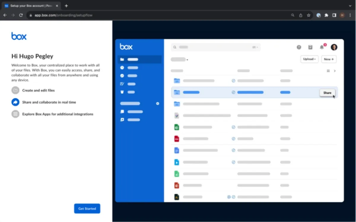
They, Box opts for simple and straightforward mini modals and nudges. In the right side of the screen, Box suggests a carousel of action items to begin using the product.
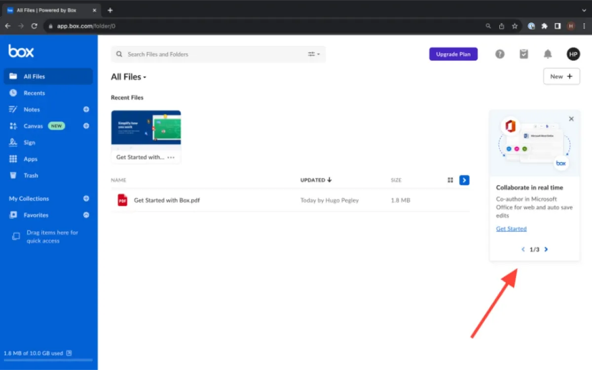
Whether you click through them or X them out, when you come back to the product it'll present another similarly spaced carousel of slightly different action items.
Finally, on your third visit the carousel will present another set of options (you know what they say: third time’s a charm!)
It should also be noted that they also present you with a user onboarding PDF, which feels a bit funky from a UX perspective initially.
But given this document is stored as your first saved item, it allows Box to prompt users to take in-document actions, like signature insertion, with tooltip nudges.
The Takeaway
Box takes a very un-intrusive approach to onboarding, which it can afford because of the intuitive nature of its service. If your product is a fairly intuitive one, know that you do not need to overload your user with pop-ups, instead keeping your nudges light and small throughout the entire onboarding process. You don't need to be prescriptive with required user onboarding checklists, rather you can be friendly and lightweight.
Command AI Wishes Death Upon Annoying Pop-Ups!

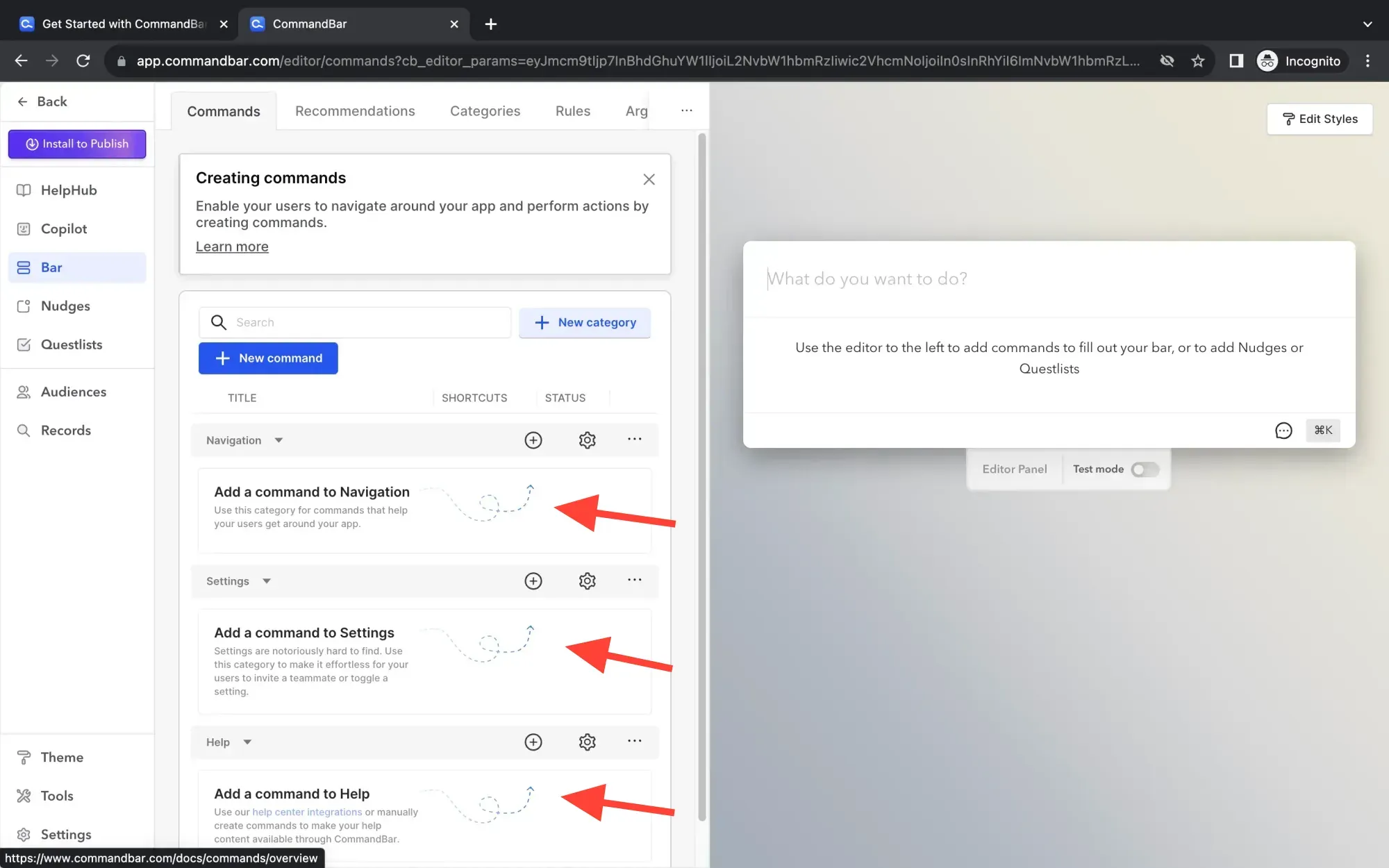
When a new user onboards to Command AI, they're looking to solve problems quickly and address key user experience issues with our tools.
To that end, we do not employ any large pop-up modals (they are BANNED from Command AI like Voldemort’s name in Harry Potter) or other intrusive elements. Instead, when a user first arrives at their “Get Started” page, they're presented with the immediate opportunity to create a new product experience through Command AI.
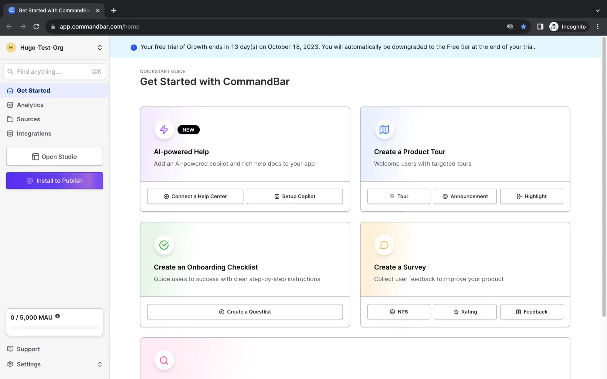
With one click, new users can enter into their initial preferred experience design.
Once inside, new users can begin building immediately using our sexy and sleek (yes, humble brag 😉) call to action buttons.
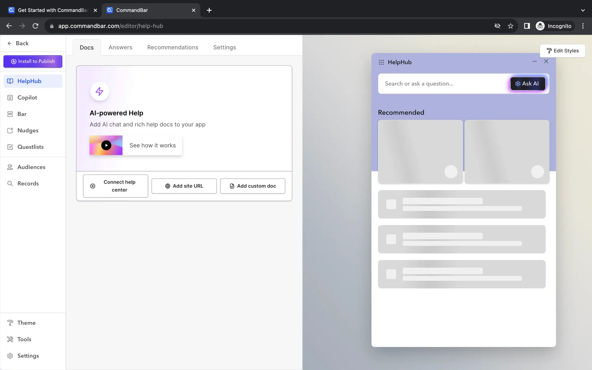
We also use small tooltip nudges towards both text and video content to help them get rolling as needed.
The Takeaway
Less can be more in user onboarding when you trust your marketing and sales teams to have prepared users for the functionality of product. Once folks get to the point that they're on the platform, they really just “get it” and want to get going building.
At the same time, we ensure that our product features are supported with clear but small tooltip nudges which help skill up new users on product capabilities.
Any company can use Command Ai to create a world class onboarding experience easily. Through implementation and user testing you can find the best way to active users and minimize UX disruptions.
How SEMRush Falls Short In User Onboarding

SEMRush is a popular SEO management platform which provides customers with analytics and research tools to improve their search engine rankings, create new content for their websites, and explore what their competitors are ranking for. And while this might be a hot take, I actually prefer the overall user experience over that of their biggest competitor, Ahrefs!
While SEMRush is one of the largest and most useful SEO platforms, they fall short when it comes to easy user onboarding, particularly for folks who are brand new or beginners in SEO. ☹️
Why is that the case?
When you enter the signup form, you're prompted to add some demographic information, including your experience level with SEO.
You would think that this question would dictate your user onboarding experience, with lots of nudges, tool tips, pop-ups, and educational opportunities for beginners, and then decreased in-app messaging as the experience level increases. This is the point of asking those questions: create a contextual onboarding experience and set user expectations – right?
However, we tested their onboarding flows both responding as beginners and as experts, and the experience does not change at all.
After you add your demographic information, you're sent to a standard landing page.
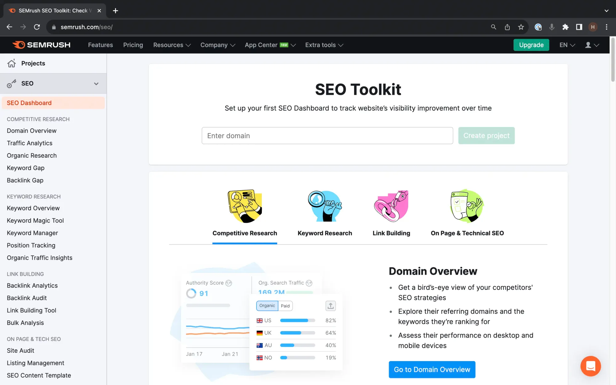
This landing page feels more like marketing copy than a friendly user onboarding destination, because as you scroll through you get a sense of what you might be able to do, but not necessarily where you should start.
At the top of the page they do prompt you to add your website name and create your first project.
However when you do this, you're sent to one of the worst user onboarding experiences you can have: a page overloaded with action items without a clear indication of what’s most important and where to begin.
For experienced SEOs, this might not be a challenge and they would begin on their own. But for beginners, this can be overwhelming and potentially put them off of an otherwise great product. At this point, even a pop-up (god forbid!) or a simple user checklist would be helpful!
The Takeaway
If we were redesigning the user onboarding flow, we would produce a set of un-intrusive but helpful in-app nudges and product tours to turn the user onboarding flow from a static and overwhelming one, into a delightful and helpful one. We would also tailor the intensity and level of hand-holding in the user onboarding flow depending upon the response of the new user SEO experience question.
SEMRush is a tremendous platform which I found very helpful as a marketer, but they have a ways to go and creating a user-friendly, and particularly beginner friendly, contextual onboarding experience (if you’re reading this SEMRush team, 🙂 we can help!)
How Canva Uses Nudges Towards Interactive Onboarding Assets to Delight Users

Canva is a powerful design creation and collaboration tool that allows individuals and teams to create multimedia assets for use on websites, marketing materials, emails, and more. Their brand is focused around creativity and inspiration, and they hold true to that ethos with a colorful and brilliant onboarding experience.
When you sign up for Canva, your prompted to enter your demographic information on a fairly large pop-up model.
They also fairly quickly offer you an upsell to their Canva Pro product (boo!), give you a chance to invite your team members to the workspace, and give them more information about your brand.
After you complete these pop-up modals, you're presented with a colorful splash of confetti, which then fades away and leaves you with their colorful dashboard.
Given Canva’s varied tools and use cases, from single image editing to multimedia creation to social media asset creation, there is a real need to educate users in a fun way, and allow them to choose which areas to explore. How do they achieve that?
Users will notice a light nudge towards a tile called “Play With Canva.”
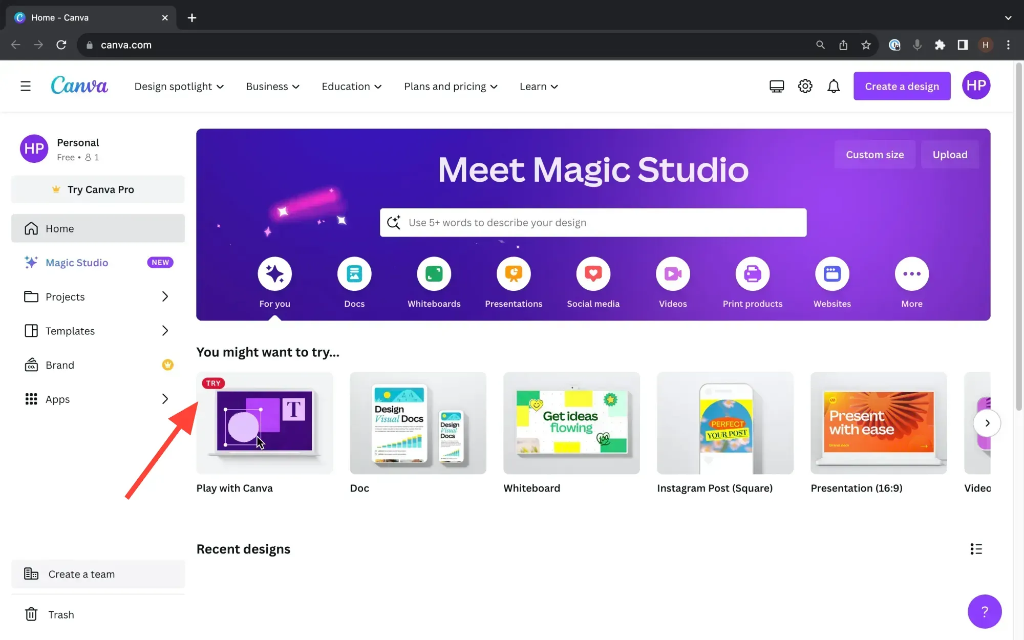
When clicked, instead of presenting a wall of text or even text with images, Canva takes a “learn and play” approach with one of the most interactive and fun slideshows we've seen to date. It really works to engage users with this kind dynamic experience, where having users complete education flows feels like fun, not work!
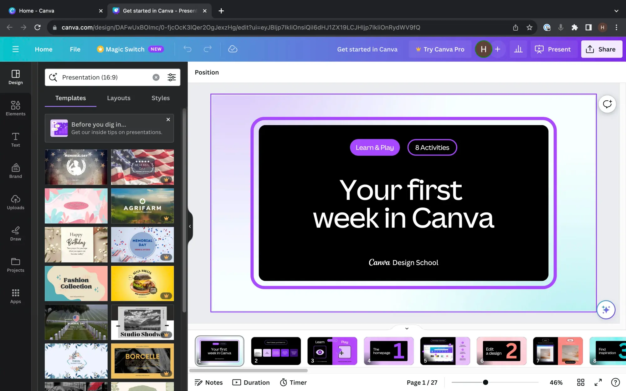
Users are guided through eight different use cases, and within the left side of each slide they can watch a short video demonstrating an action, and on the right side of the slide they are able to actually try that action in the tool.
This is a powerful way to educate users through the customer journey about your product in a fun way that focuses on learning by doing. Among our user onboarding examples, this is the most fun one for sure (and who doesn't love fun?!)
The Takeaway
Canva is a great example of how focused initial pop-up modals, paired with light nudges towards more in-depth onboarding assets can create a fun, colorful, and interactive user onboarding experience which drives product adoption and understanding.
How to build these product experiences easily?
In this article we've seen a wide variety of in product experiences from product tours to nudges to tooltips. The easiest way to build all of these in your product is with Command AI. We make it simple to build, target, and deploy all of these into your application with minimal Engineering help.
A simple survey takes just 30 seconds to launch:
But even checklists and product tours are easy to build.
An easy to build checklist
With Command AI it's easier than ever to build these in product experiences quickly while still ensuring they are high quality, improve your UX, and are backed by a great analytics dashboard.
For example, when you run nudges in-product, you will naturally have some users who close them out. We call these "strikes," since the user is striking them out.
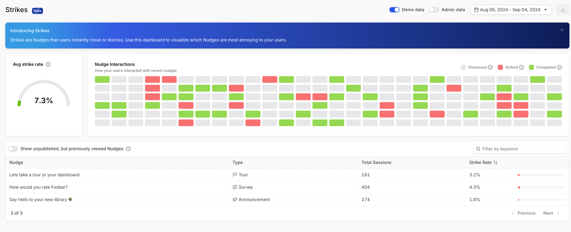
In your Strikes dashboard, you can actually visually see how different nudges are performing, what your strike rate is, and get better insight into what converts and engages the best.
All together, Command AI offers the easiest path to improving your onboarding and increasing user acquisition and delight.
Conclusion
Successful user onboarding requires a friendly balance of discovery and education with a responsive and friendly UX. For most software, onboarding is not a “one size fits all” experience or flow. It’s vital to understand your new users persona before you dive into skilling them up on your application. This knowledge can also help ensure that the in-app messages you use, be they pop-ups, tooltip nudges, or product tours, are accurately calibrated for the users primary use case. Additionally, employing the right onboarding tools can significantly streamline this process. Discover some of the best customer onboarding tools that can assist you in creating an engaging and effective onboarding journey for your users. Once you understand your users, you can successfully employ the tactics and strategies outlined in this article to increase your user activation and enhance your overall customer satisfaction.
Frequently Asked Questions
Difference between popups and nudges?
Pop-ups and nudges are both in-app messaging tactics, but they differ greatly in their style and optimal application. A pop-up is more intrusive and takes up more of the screen, and should be used for mission critical items in the initial onboarding flow. A nudge can be a light tooltip or suggestion to your app users to try a new feature.
When should I use a nudge vs a popup?
Pop-ups are ideal for required items, like security or initial account setup. Nudges are better when you want to introduce users to new features, or guide them through a series of suggested actions. It can also be helpful to get direct user feedback about your onboarding experience to gauge your usage of different messages.
What are the best practices for using pop-ups and nudges in SaaS user onboarding?
First, you have to understand your users demographics and intent so that you can understand user personas and customize the user journey. Then think about what the most important information for them to intake in their first 5 to 10 minutes on the platform is. Finally, diagnose whether a pop-up or a nudge or product or is ideal to convey that information, and then splice up your user onboarding in-app messages appropriately.
How can we ensure that our pop-ups and tooltips are effective in guiding users to adopt our product?
Have a strategy in place to measure the performance of your in-app messages. Constantly test and optimize them, and work to make your user onboarding process seamless.
What are some common mistakes to avoid when using pop-ups and tooltips in SaaS user onboarding?
Avoid using pop-ups unless you think they're absolutely necessary. Make sure you have a way to measure the efficacy of your different in-app messaging. Finally, don't be afraid to use nudges aggressively but appropriately as they can drive great results.
How are in-app messages different from push notifications?
In-app messages appear exclusively within the application, while push notifications can appear outside like in an email or a text message.
