


A first impression is everything, and in the digital world, especially if you happen to be a B2b business, that first impression happens on the welcome screen. It's the virtual handshake, the initial "hello" after a user signs up to your app or platform.
A well-crafted welcome screen can be a powerful tool in guiding new users through the self-service onboarding process. Many businesses use this opportunity to gather important information from users. Their name, team size, goals, etc. It can all be found there on the welcome screen. But let's face it – bombarding people with questions right off the bat is a surefire way to make them wary of what you're really after.
Striking the perfect balance between gathering essential data and keeping users engaged is a tightrope walk. On one hand, you need information to tailor the product experience to the user. On the other, an overwhelming questionnaire can leave users feeling more fatigued than welcomed.
So, how do you navigate this? The answer might surprise you: it's not about asking all the questions at once. Instead, consider requesting information and educating users in smaller, digestible bites on the welcome screen.
The problem with overloading users
Nothing kills a first impression faster than an interrogation (and some welcome screens can truly feel like that!). A welcome screen packed with question after question is the digital equivalent of an overbearing host. It's exhausting, off-putting, and can leave users feeling more like lab rats than valued customers. In fact, a complex onboarding process could drive 89% of potential customers to seek alternatives.
This information overload can seriously impact how users perceive your product. Instead of feeling excited about what you have to offer, they're left feeling frustrated and resentful.
And let's not forget the bigger picture – the goal for you isn't just to collect data; it's to activate users and guide them towards the aha moment – the point where they realize the value of your product. When you're too focused on filling out your data sets, you risk losing sight of what truly matters: helping users succeed.
Adopt the micro-survey approach
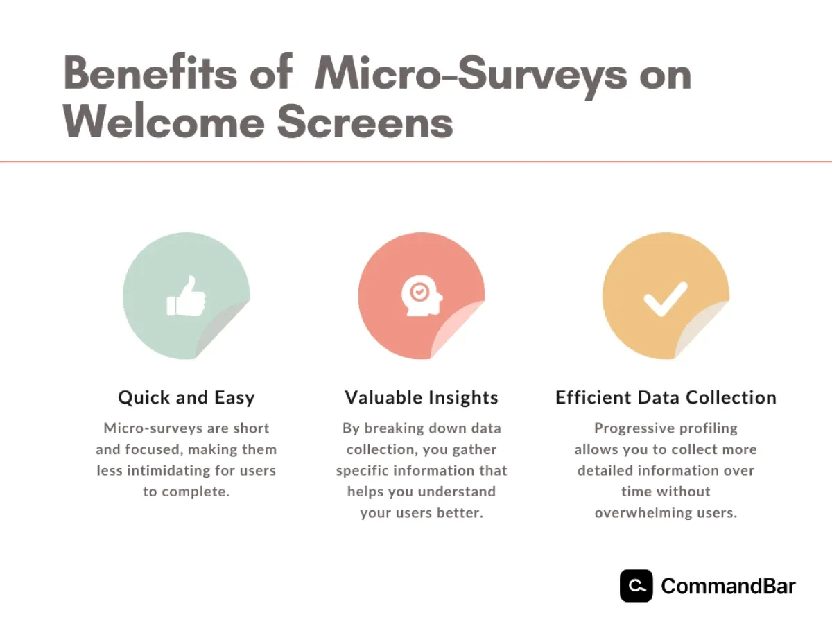
Imagine if instead of a marathon questionnaire, you offered users a series of quick sprints. That's the idea behind micro-surveys. These bite-sized questionnaires focus on gathering specific pieces of information, making them less intimidating and more likely to be completed. By breaking down the data collection process, you can gather valuable insights without overwhelming your users.
So where should you start?
The key is to identify the most critical information you need to know upfront. What are the core factors that will influence a user's experience? Once you've pinpointed these essentials, you can design your initial micro-survey.
This is where progressive profiling comes in. Instead of demanding everything at once, you gradually collect more details over time. As users interact with your product, you can present them with additional, relevant questions. This approach not only respects users' time but also provides you with a richer dataset for analysis.
What micro-surveys look like on welcome screens – Asana, Canva, and Notion
Let's explore how some of the most popular SaaS products use micro-surveys on their welcome screens to gather the most important information to shape user experience.
Asana
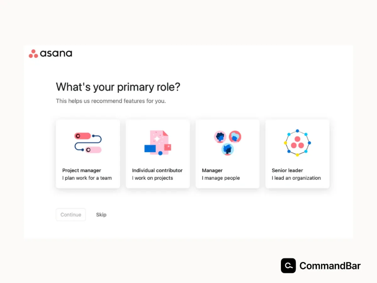
- Team size: Understanding the size of the team joining Asana helps them tailor onboarding and feature recommendations.
- Industry: Identifying the industry provides insights into potential workflows and feature preferences.
- Project management experience: Assessing users' familiarity with project management tools helps guide the onboarding process.
Canva
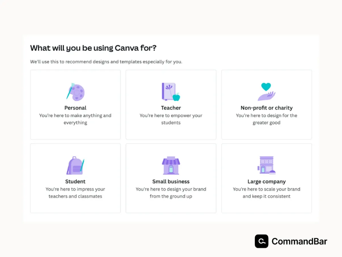
- Design experience: Determining users' design proficiency helps to recommend suitable templates and tutorials.
- Team role: Identifying the user's role within the team (designer, marketer, etc.) helps tailor the welcome experience.
- Design goals: Understanding the immediate design needs helps Canva suggest relevant features and templates.
Notion
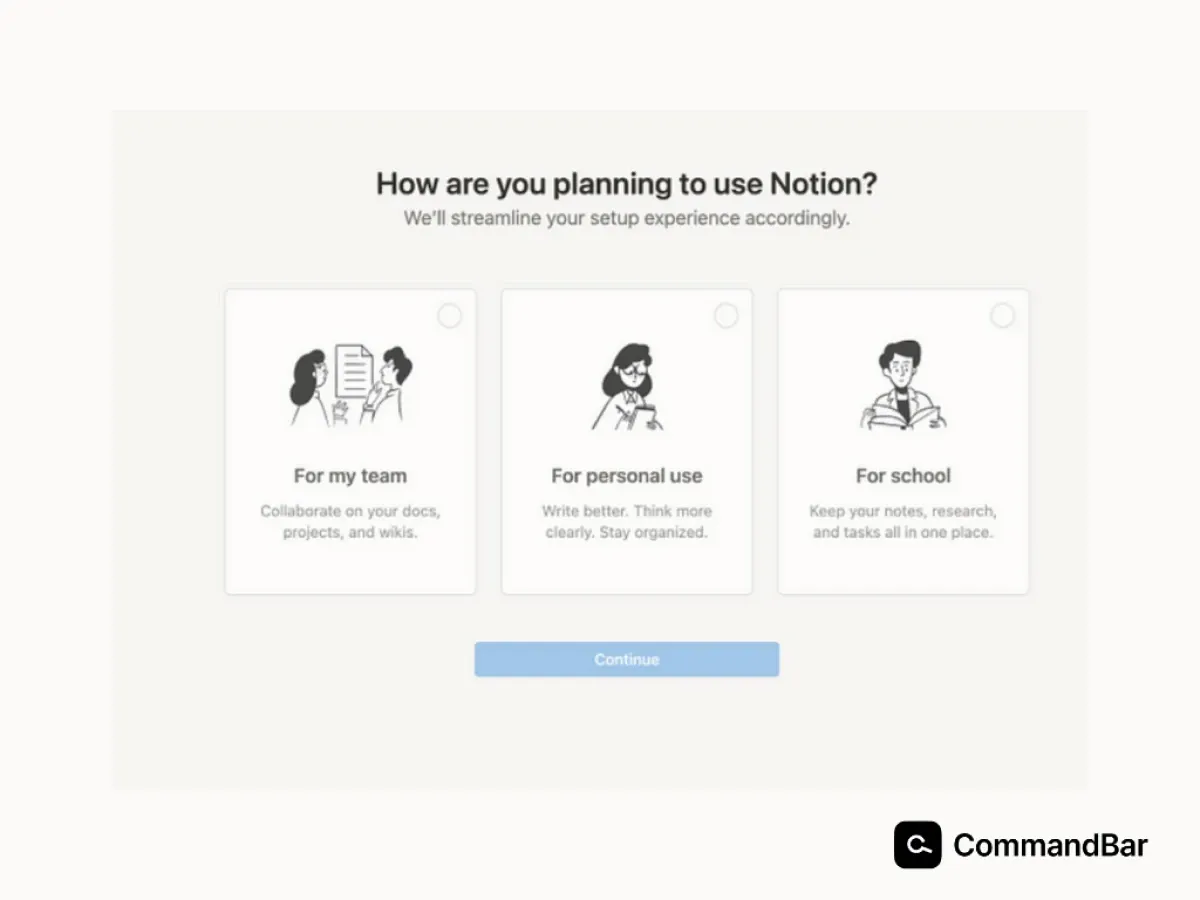
- Workspace type: Determining if the workspace is personal or for a team influences onboarding and feature recommendations.
- Primary use case: Understanding the core purpose of using Notion (note-taking, project management, knowledge base) helps them tailor the initial experience.
The welcome screens employed by Asana, Canva, and Notion exemplify best practices by prioritizing conciseness and mobile optimization. These platforms effectively balance gathering essential information with maintaining an inviting user experience.
Designing effective welcome screens
Let's dive into how you can make that first impression with a welcome screen, a "wow" impression.
Get these elements right
A compelling welcome screen should include:
- Clear and concise headline: This should immediately communicate the product's value proposition.
- Strong visual: An image or graphic that reinforces the headline and creates a positive first impression.
- Call to action: A clear and compelling prompt to guide the user forward – don't forget to make it exciting!
Balance simplicity with information
The challenge lies in conveying essential information without overwhelming the user.
- Prioritize information: Focus on gathering the most critical details.
- Use clear and concise language: Avoid jargon or complex question structures.
- Visual hierarchy: Employ design elements to guide the user's attention to important information.
Don't forget to use visual design to your advantage
Visual design plays a pivotal role in shaping user perception of the welcome screen.
- Color psychology: Choose colors that evoke the desired emotions (e.g., trust, excitement, calm).
- Typography: Select fonts that are easy to read and complement the overall aesthetic as well as your brand guidelines.
- Imagery: Use high-quality visuals that resonate with the target audience.
- White space: Create a clean and uncluttered layout to improve readability.
Create a sense of welcome and anticipation
A well-designed welcome screen should make users feel valued and excited about what's to come.
- Personalized greeting: If possible, address the user by name.
- Social proof: Showcase positive reviews or testimonials to build trust.
- Progress indicators: If the onboarding process involves multiple steps, consider using a progress bar to manage expectations.
Tailored assistance using in-app nudges
Nudges are subtle prompts or cues that guide users toward desired actions without restricting their choices. They're like gentle pushes in the right direction. In the realm of user experience, nudges can significantly enhance user satisfaction and engagement by providing timely and relevant assistance.
Leverage survey data for personalized recommendations
Survey data is a goldmine for creating personalized nudges. By analyzing user responses, you can identify specific needs, preferences, and pain points. This information can be used to:
- Segment users: Group users based on shared characteristics for targeted nudges.
- Recommend features: Suggest features that align with user goals or preferences.
- Offer personalized tips: Provide tailored advice based on user behavior along with educational resources.
- Optimize the user journey: Guide users towards specific actions based on their progress and workflow.
Measuring the success of the welcome screen
Designing the welcome screen is one thing. Finding out how effective it is, is quite another task. To gauge the effectiveness of your welcome screen, focus on these key metrics:
- Bounce rate: This indicates the percentage of users who leave the welcome screen without proceeding further.
- Time on screen: How long users spend on the welcome screen can provide insights into engagement.
- Click-through rate (CTR): Measure the effectiveness of your call to action.
- Conversion rate: Track the percentage of users who complete a desired action after the welcome screen (e.g., land on their home page after initial sign-up).
- Completion rate of micro-surveys: If applicable, measure how many users complete the initial survey.
Iterative optimization based on data
Data is your guide to improvement. Use it to optimize your product’s welcome screen.
- Analyze metrics: Regularly review performance metrics to identify trends and areas for optimization within the welcome screen.
- Test and learn: Experiment with different design elements, copy, and CTAs to find what works best.
- Set clear goals: Define specific objectives for the welcome screen and track progress towards those goals.
- Continuously improve: Welcome screen optimization is an ongoing process. Regularly refine your approach based on new insights.
Make the welcome screen a strategic tool for your business
The welcome screen is often overlooked, but it's a critical touchpoint in the user journey. It’s your first opportunity to make a positive impression, set expectations, and gather valuable information from the user. By crafting a welcome screen that is both inviting and informative, you can significantly improve user engagement and retention, while personalizing their app experience.
The micro-survey approach offers a powerful way to gather crucial data without overwhelming users. By breaking down the information collection process into smaller, digestible steps, you can build a stronger relationship with your audience.
Remember, the world of design and user experience is constantly evolving. What works today might not work tomorrow. That’s why embracing a culture of experimentation and continuous improvement is essential. By tracking key metrics, analyzing user behavior, and iterating on your welcome screen design, you can create an exceptional user experience that drives long-term success.