There are a few very good reasons the OpenAI team chose a chat-like interface for its Large Language Model (LLM), the now omnipresent ChatGPT.
For one, it’s familiar and intuitive. The original GPT3 playground allowed you to converse with a cybermind, but the manner of doing so (prompt, get answer, change prompt, continue) was very API-like and therefore unfamiliar to most. But chatbots, where the agent we’re chatting with has the full context of past interactions? Makes sense. We know them. We see them pop up in the bottom right corner of most websites, asking us if there’s anything they can do for us.
While making AI more friendly and approachable is certainly a goal for many AI developers and researchers, the decision to use a chat interface for ChatGPT likely had other strategic reasons behind it. Getting more users to input thoughts and questions in their own words helps the model collect data on how people communicate and use language, which then improves the accuracy and responsiveness of the language model.
But recent examples of AI conversations in the wild beg the question: are we commanding the AI, or is it commanding us?

Jokes aside, the notion of commanding machines to perform our bidding is akin to having jetpacks, flying cars, and nuclear fusion on the Mount Rushmore of futurism bellwethers. Luckily, the future is looking bright for futurists, with advances being made in each of these areas.
Jetpacks are in the works, we’re making progress towards nuclear fusion (despite some setbacks), and while flying cars don't appear to be all that promising, we’ve made strides in space travel. And unless you're on a Twitter hiatus, you've probably started to see demos popping up of machines being able to execute natural language commands with relative ease and without much guidance.

For the first time, it seems like the prospect of issuing natural language commands to machines and having them execute tasks flawlessly is on the horizon. And yet, there's a weird tension in these demos.
What’s the purpose of the GUI if we can simply write a command and get the task done?
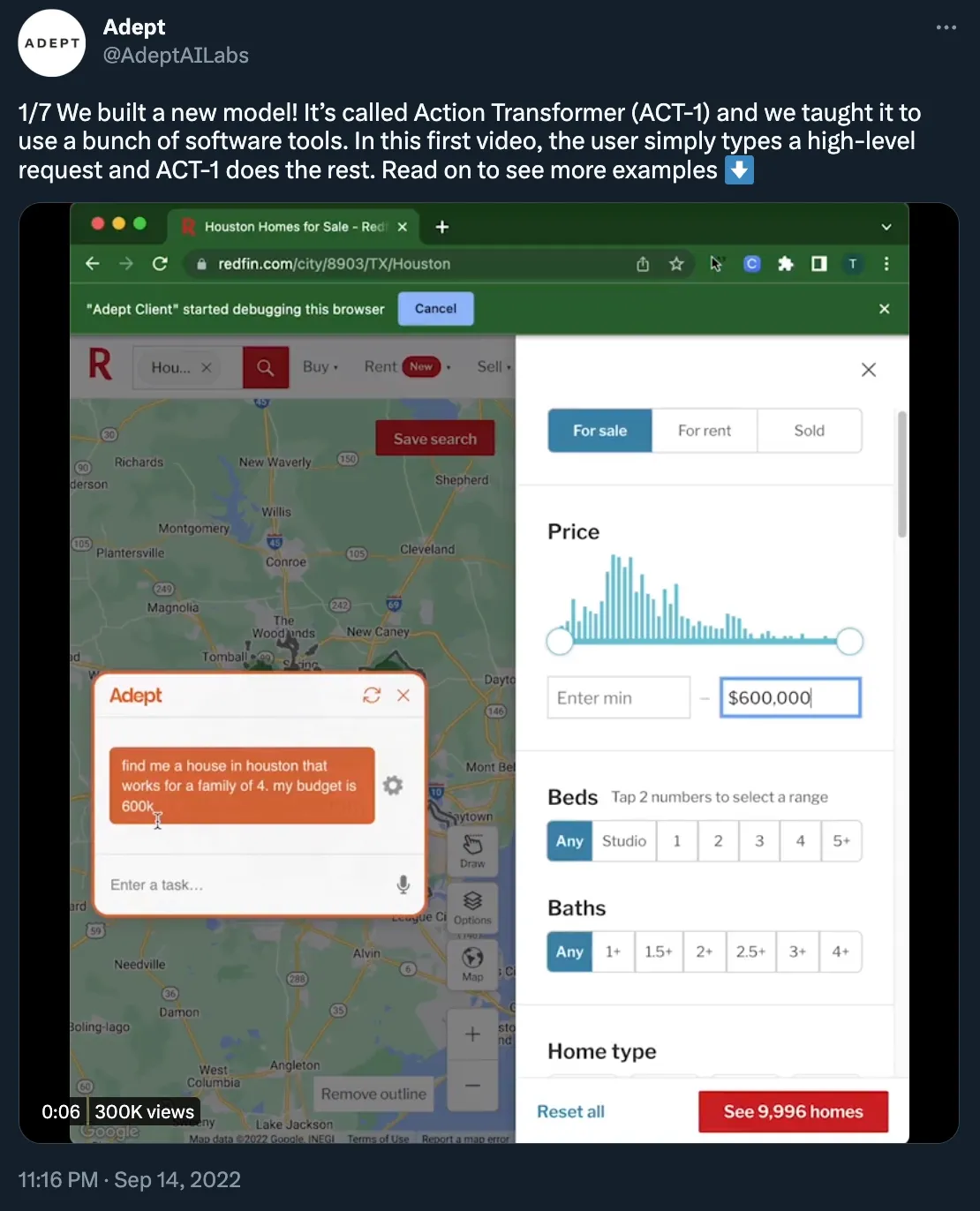
Before we can answer that, let’s look at the Redfin example above. Without the AI, the typical behavior of a user would follow a variation of:
- Go to https://www.redfin.com
- Type in the location in the search bar
- Go to filtering
- Type in the price range
- Choose other variables like the number of bedrooms and bathrooms
This is, of course, if you’re already familiar with the UI of the website. Add in a few extra steps and back-and-forth if the actions you’re looking to make are not in plain sight, but rather “hidden” behind a few menus.
Adept’s model lets you type in “find me a $1,500,000 two-bedroom home in Houston” and watch all those actions being performed without your manual input.
What had to happen for this demo to exist? Redfin maintains a database of homes (or connects to a database), built an API to search this database, and built a GUI for humans to interact with that search API. Adept then trained a model to interact with that GUI.
But we don’t actually need (or want) to sit there and watch the model use the GUI. It feels stilted and slow. Since APIs give us access to the data, why should the model do a human impersonation and click and scroll through the UI?
In a recent deep dive, we talked about how GUIs are an evolution of command-line interfaces. Their original purpose was to help uninitiated users break into the world of computers. But that’s not the case anymore. For the most part, we know how to use computers without needing a user manual or prompts to guide us. UIs are becoming increasingly more complex, and, dare we say, clunky at times.
That’s why we made the case for AI and command bars coming together to help humans talk to computers through a wonderbar. For the catastrophizers out there, we’re not saying GUIs will become extinct. It’s likely that they will survive the LLM meteor strike (at least for the foreseeable future) and evolve. Here’s what might happen in the process.
How the GUI might evolve with AI
1. You won’t need to learn a GUI for infrequently used apps
Use cases like initiating a return, scheduling an appointment at the DMV, or getting a refund status from the IRS don’t need complex apps.
GUIs destined to be used infrequently and with a clear, straightforward purpose will converge to a wonderbar that “API-fies” all of its actions.
2. Text as the universal interface (because everyone already knows it)
Many people who use software aren't that comfortable with standard design patterns. It’s why we’ll continue seeing wonderbars crop up in apps where “power users” exist (like developer tools and productivity apps). The more someone uses an app, the more they’ll look to optimize the time they spend on it.
It’s a similar situation when it comes to HR or banking software, whose UI tends to be busy and complex to navigate, but that has defined actions users are familiar with.
“Add X as a new team member in the Y team” or “Make a $500 wire transfer to ‘Mom.’”
The downside?
3. A new litmus test for deceptive design will emerge
Asking the AI to perform actions for you doesn’t leave much room for the UI to trick you into subscribing to newsletters or creating subscriptions.
However, companies might omit value-destructive actions like “cancel subscription” or “file a complaint” from a wonderbar result. The best apps aren't afraid to staff a competent ombudsman.
On the other hand, when present, destructive prompts (“delete database”) need to have clear warnings, which might be easier to ignore through text and trickier to design through a wonderbar.
4. Wonderbars with NLP might be huge for accessibility
…and might become a prop for accessibility theater.
There are many details you’ll need to get right before putting the accessible stamp on your wonderbar. Some to consider:
- Allow for multiple input methods, including speech-to-text and keyboard support
- Ensure compatibility with screen readers by providing descriptive text for all elements of the interface
- Use error handling
Remember, a bar that works for most user journeys is not a skeleton key to the GUI. While a command bar can be an efficient way to interact with certain parts of an application, there may be other features or functions that are better suited to traditional GUI design elements.
5. Product teams will freak out
Launching a wonderbar will inevitably lead to lower engagement. As it turns out, users don’t need to click around through seven pages and read three help center articles to create an account.
Engagement is already dying as a standalone KPI, and this will knock it on the head. It’s no longer about the number of pages a user views, but rather, are they getting the outcome they came for? And most importantly, are they coming back because of that?
6. Apps that rely on engagement loops will maintain rich GUIs alongside their wonderbar
Operating systems, task managers, social media platforms, and games won’t see the same benefit from using a wonderbar alone. Products that are driven by these engagement loops will need to keep users engaged and entertained with shiny buttons and a dynamic, ever-changing UI.
People don’t go on LinkedIn to search for “the year my manager graduated” (not very often, at least). They go to see the full picture, and a rich GUI provides that.
7. A Cambrian explosion of new GUI primitives
Steering wheels all look the same because that's what drivers are used to. With autopilot, do they need to? New, unconventional design elements are necessary to accommodate new technologies and use cases, and wonderbars can be the catalyst for these.
They’re an escape hatch, which means we’ll get to see app developers and designers go back to the drawing board, get their hands dirty, and experiment again with whacky controls and unconventional UI.
Fun times ahead.


