


SaaS landing pages are 24/7 sales machines. They are always ready to pitch. They greet every visitor with the perfect opening line. They highlight your product’s features in seconds. That is, if you know how to craft them. So, what makes some visitors stick around and others bound faster than a customer dodging a commission-hungry sales rep?
Glad you asked because we’ll explain right now.
The Landing Page Tactics Your Competitors Use
Most of these tactics, barring one or two technicalities, boil down to three things: clarity, emotion, and urgency.
Grab Attention with a Strong Headline
Ten seconds. Ten words. That's all you get. Your headline must be focused, relevant, and promising. Don't overthink it. Tell your customers how you help them in the most straightforward way possible.
Say you type a headline that reads - "Struggling with customer churn?"
You think it's decent.
However, a more impactful option would be - "Reduce customer churn by 25% in 90 days."
Why? It offers a clear solution and specific benefit within a defined timeframe. It's direct, promising, and actionable - no BS.
Just so you know, it takes a few iterations to land on the right headline (pun intended).
Include Your USP in Your Subheadline
The headline is the first attention-span hurdle, and the subheadline is the second. To get people to continue reading, let them know what your business does.
If we continue with our example, a subheadline might be - “ChurnGuard’s AI-powered platform identifies at-risk customers and boosts loyalty.”
You’re explaining how your business solves their problem. Here, the unique selling point is an “AI-powered platform.” The trick is to give them just enough information but still leave them wondering: So, how exactly does ChurnGuard’s platform work? A bit of mystery keeps them reading.
(By the way, this example is completely made up.)
Next, List Benefits, not (just) Features
Any decent copywriter will tell you that customers care about how your product benefits them, which is why your landing page needs to communicate a strong value proposition. Investopedia defines it as “a concise statement of the benefits that a company is delivering to customers who buy its products or services.”
For instance, claiming one of ChurnGuard's benefits is “predictive customer insights” will probably elicit a shoulder shrug because you’re just listing a feature. Instead, you should say, “Predictive Customer Insights: Gain a deeper understanding of customer behavior and anticipate churn risks before they become critical.”
Can you see how explaining the benefit makes the product invaluable?
Finish with a Compelling CTA
Once you've gotten readers to the bottom of your landing page, you need to instruct them where to go next. In marketing-speak, this is called a CTA, short for call-to-action. It sums up your landing page's intent. You've probably seen CTAs like "Download eBook," "Get a Quote," "Request a Demo," and "Book a Call," etc.
They're pretty ubiquitous and do the job, but they could be better. CTA buttons amplifying value over action will likely have higher conversion rates. For example, "Sign-up Now" transforms to "Create Your Website." In our original example, "Get Demo" could be changed to "Stop Churn Now."
Ideally, your CTA should be three to four words, written in clear, action-orientated language to prompt immediate action. You can up the ante by adding urgency and scarcity, such as "Limited Time Offer" or "Secure Your Spot Now."
Please, Don’t Neglect Clean and Attractive Design
Okay, so you can have the best copy in the world, but it won't convert visitors if your landing page design is bad. Bad = cluttered, overwhelming, and unbalanced. It's the difference between asking a toddler and a Michelin-star chef to plate a dish,
Designing a landing page is easiest when hiring a professional or using software like MailChimp or Canva. These platforms offer easy-to-use, plug-and-play landing page templates. Note: A beautifully designed landing page has enough white space for visitors to absorb. Its colors and fonts are consistent to maintain visual appeal.
What About Visuals?
Visuals are important (sometimes).
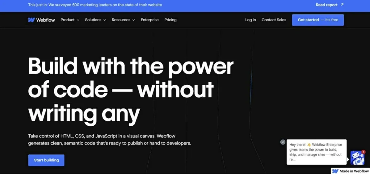
Although Webflow’s landing above does not include an image or video, it is still visually appealing. Compelling copy, strong design, and a clear value proposition are just as effective as driving conversion. Even if you don’t embed an image or video, always consider headline placement, font size, and color visually.
One of the design principles of web pages is called above the fold, which refers to the part of the webpage that's immediately visible to you without scrolling, i.e., the top part of the screen (see above). Landing page images are often placed above the fold to catch the reader's eye immediately. There are many tools that can help optimize these images, such as a background remover, which can simplify visuals and make the key elements stand out more effectively.”
So, if you want your image to be one of the first elements visitors see alongside the heading, position it prominently at the top of the page. Pro tip: The exact location of the fold varies depending on the device and screen size, so double-check before hitting the publish button.
Add Social Proof if You Can
Since most people Google for products and services, how do they verify if a product or service is good? They look at reviews, testimonials, and company badges - otherwise known as social proof - to find reassurance, trust, and validation. 93% of consumers admit that online reviews influence their purchases. That’s 9 out of 10 of your customers!
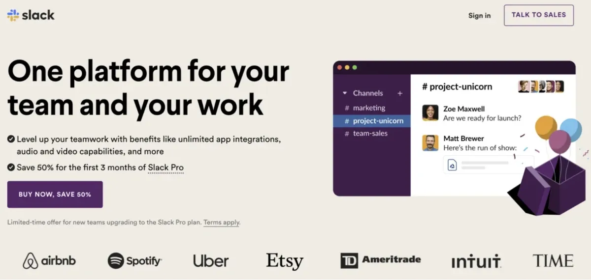
Slack uses the logos of companies that have major clout to instill social proof. Did you know they service 65 of the Fortune 100? That’s more than half the market. How’s the relevant? Well, they’ve tactically leveraged the logos of the companies that are most well-known. Is there anyone who hasn’t heard of Airbnb? Thought so.
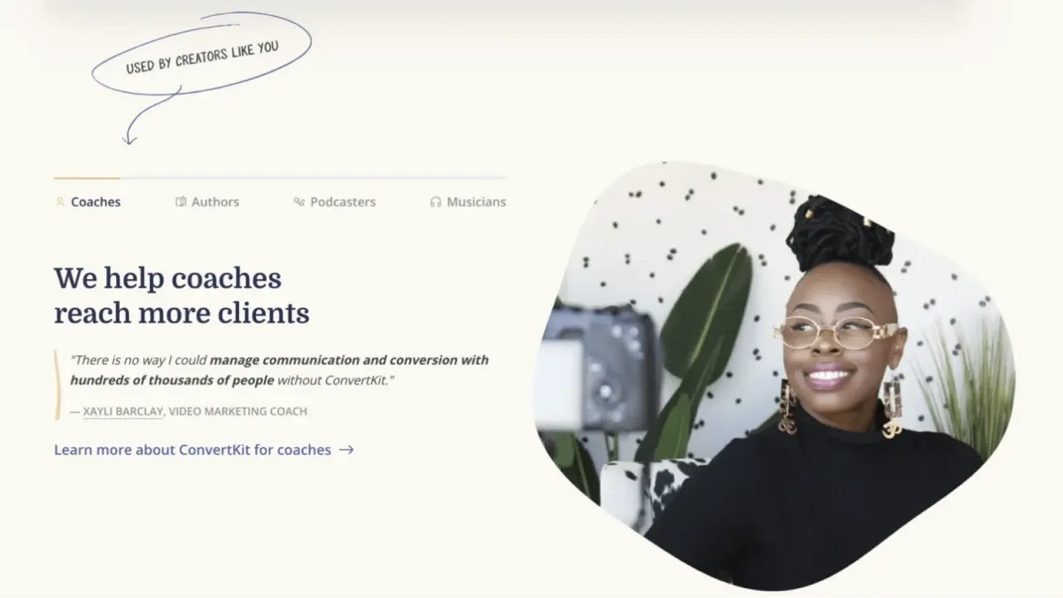
ConvertKit leverages personal appeal by showcasing a client testimonial as its subheading. This way of displaying social proof works well for its target audience. The testimonial substantiates a benefit with real numbers. It appeals to emotions while also providing tangible data, increasing ConvertKit’s trustworthiness.
Integrate SEO Throughout
Like any other piece of content published on the web, following on-page SEO best practices for your landing page helps it rank higher on search engine results. At the very least, your heading should contain your main keyword. And the body of your text should contain secondary keywords. The same goes for meta descriptions.
It’s impossible to explain the ins and outs of on-page SEO in one paragraph, but industry-leading SEO tool Semrush has a brilliant SEO blog to help you. We should also mention implementing technical SEO - ensuring your landing page loads fast and is easy to use. For more information, read Backlinko’s definitive guide.
FYI, There Are Different Types of Landing Pages
There are three main types of landing pages:
- Lead Generation: Grows leads by capturing visitor information (name, email, phone number) in exchange for an offer like a free trial, webinar, or ebook.
- Sales: Converts visitors into customers by promoting a product or sale
- Click-through: Directs visitors to another website page or external site to drive traffic to specific content, like signing up for an event.
Each requires a different conceptual approach. For instance, a sales landing page focuses on a product’s benefits, whereas a lead generation landing page offers something valuable in return. These subtleties alter design and copy, so make sure you know which one you’re creating.
A/B Testing Is a Must, Not an Option
Now for a widely-known secret:
Pssst, psst, psst.
Whispers loudly:
Landing pages work when they are brilliantly designed and A/B tested.
You must compare two or more versions of your landing page to see which achieves its goal better, be it sign-ups or conversions. A simple headline or changing a CTA button will influence how many users do what you want them to.
Marketing is data-driven and costs money. Naturally, you want to derive maximum ROI. A/B testing is one way to do so because you’re optimizing to get the highest number of leads to act. Even if your landing page is performing really well, there’s always room for improvement.
Hypothetically, let’s pretend you have a SaaS landing page selling a subscription for $25 per month. Your current page gets 15,000 visitors per month and has a 2% conversion rate, resulting in $7,500 in revenue. You then conduct an A/B test and add an image to your landing page. Suddenly, visitors increase to 20,000 in a month.
Your conversion rate stays the same, but your revenue now sits at $10,000. Over a year, your bottom will grow from $90,000 to $120,000. That’s what changing a “simple” color scheme, layout, messaging, or headline can do for your SaaS business. As they say, the devil’s in the details, or in this case, analytics.
Time to Beat Competitors
Whatever you do, make it easy for visitors to act. The less friction, the better. Remember, high-converting SaaS landing pages exude clarity, emotion, and urgency. They are not your homepage, so don’t try to highlight every incredible thing your SaaS product does. The power of a landing page is its ability to achieve a single goal well - just like the best SaaS products maintain a core focus.


