Have you ever opened an app or a webpage, eager to accomplish something, only to find yourself lost in a maze of options and unclear directions? It's like trying to solve a puzzle without knowing what the final picture is supposed to look like.
This disconnect isn't just about poor design — it's a failure to capture and cater to user intent in your user flows. In the world of SaaS, understanding and designing with this intent in mind isn't optional; it's essential for converting visitors into loyal users.
So what is a user flow, exactly?
A user flow is the path that a user takes to accomplish a specific task within your product, including all the steps from entry to the final action.
Some examples of user flows include sign-up/registration, onboarding, checkout, subscription upgrades, account setting configurations, feature discovery, and countless more.
While user flow is important to consider in all industries, it’s especially important in SaaS because most software companies rely on subscription models. Sustainable subscriptions come from steady conversions and retention, both of which are closely tied to the in-product experience.
When companies carefully consider the various user flows in their product, they can streamline onboarding, simplify complex processes to keep people in their platform, and make it simpler to buy their product in the first place, to name a few.
What isn’t user flow
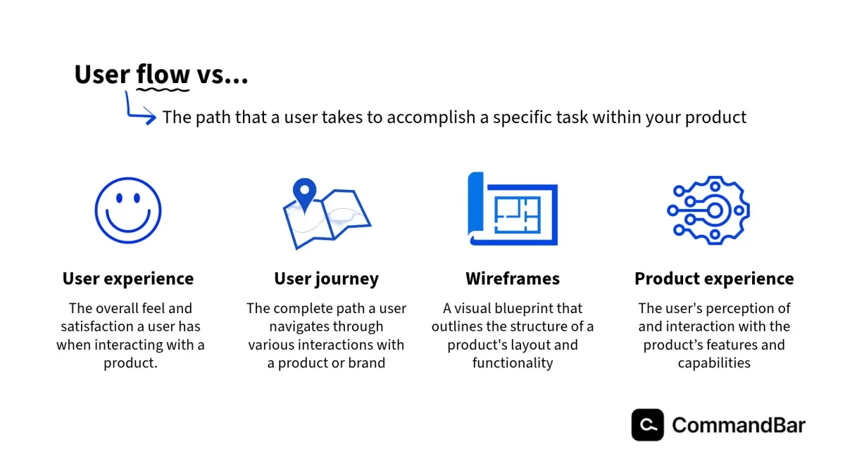
There are seemingly a million buzzwords floating around with the word “user” in them or with concepts that intersect with user flow. But they can’t be used interchangeably. Here are some commonly confused terms and what sets them apart.
- User experience refers broadly to all aspects of the end-user's interaction with a company, its services, and its products. Some elements that shape this interaction include usability, accessibility, performance, design/aesthetics, and customer support.
- User journey refers to all of the steps your users take with your product or brand, while user flow refers to one task or goal. User journey mapping often includes several user flows as one part of the map.
- Wireframes are a visual representation of the user experience that are often used in UX design in SaaS.
- Product experience refers to the customer's holistic perception and interaction with a product itself, encompassing the design, features, benefits, and functionality. This zooms in on the product-centric aspects of the experience, including how the product addresses the user's needs, its performance, and its value proposition.
User flow includes:
While the exact steps (and number of steps) in a user flow can vary from product to product and flow to flow, there are four main categories of steps.
Entry points are where users begin the flow. Entry points could include dashboard widgets, menu selections, in-app notifications or pop-ups, and direct links or buttons.
Once inside a flow, users engage with a series of steps. These are the required actions they need to perform to progress toward their endpoint. Depending on the specific flow, there could be a single step or many. Some examples are data entry fields, configuration settings, or more interactive elements like drag-and-drop interfaces for organizing content or adjusting settings
Decisions are essentially forks in the road where users must choose between different paths. These help to shape the user’s experience to align with their specific needs or goals. A handful of possible decisions are choosing a template or layout for a project or document, selecting a subscription level, and opting in or out of settings
Finally, endpoints are the final action of the flow, or the goal that your user was trying to achieve. Some potential endpoints are scheduling a social media post, sharing a report with a team member, finalizing settings, or completing a purchase.
I’ll give you real-life examples of these a little later!
But more importantly, a strong user flow takes intent into account
Creating impactful user flows requires more than just mapping out the steps users take within your product. It demands a deep dive into the motivations and intentions of your users—understanding not just what they do, but why they do it.
To do this, you need great intent data. This information gives you insights into what your users aim to achieve when they interact with your product.
What do I mean by user intent data?
First-party data, which is data you collect directly from your interactions with users, is particularly valuable here. It can be gathered actively, through methods like user interviews, surveys, and behavioral assessments, or passively as users navigate your site, get in touch with support, or sign up for newsletters.
You want to be specific about the point in the user journey you’re collecting this data. User flow is specific to particular stages in the overall journey. So to craft a flow that is personalized to your user’s goals, challenges, and state of mind at that exact moment, you can’t use general indicators as a guide.
Putting user intent data into action
Let’s take a look at how creating intent-driven user flows looks in practice.
For example, if behavioral data shows that a big chunk of your users frequently uses a certain feature but only after navigating through several less efficient paths, you might streamline access to this feature directly from the dashboard or introduce an in-app guide to highlight it to new users.
Another example: You notice that the angriest support tickets come in when your users try to accomplish a certain goal, like collaborating on a document with a team member or accessing reporting features. This is a good indicator to either cut out unnecessarily complicated steps in that flow or add helpful tooltips to guide them through.
So, let’s put this all together and see what a full user flow would look like if it’s rooted in alignment with user intent.
Check-out flow
When a user is checking out on a platform, their goals are typically:
- Simplicity
- Clear understanding of cost
- Flexibility in payment options
On the flip side, their challenges are:
- Concerns over payment security
- Complicated checkout processes
- Lack of clarity on the best option for them
- And the time needed to input their payment
Figma, the interface design product, has reimagined the checkout flow to not just meet but also anticipate customers’ needs, ensuring a seamless transition from free to paid services.
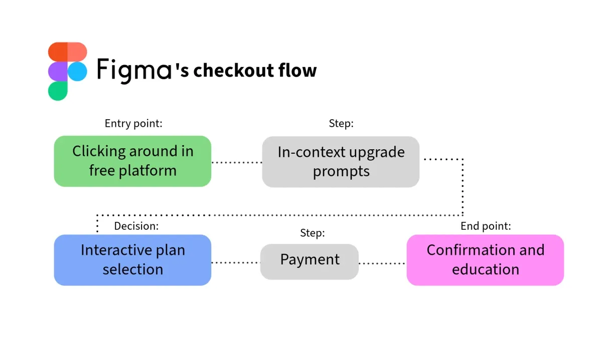
They strategically inject simplicity into the flow and tips to make the decision-making process easier.
- Entry point: Playing around in the free platform
- Step: In-context upgrade prompts
- As users explore features within the free version that are limited or locked, Figma gently prompts an upgrade, providing contextually relevant information about the benefits, which naturally pushes users along in the decision-making process. For example, if they notice that they take advantage of a lot of the collaborative abilities in the platform, they may push messages that give them ideas for premium features that help them enhance this collaboration.
- Decision: Interactive plan selection
- Users can interactively select their plan through a dynamic interface that immediately responds to their selection, providing a personalized breakdown of the plan’s features and limitations.
- Step: Payment
- The checkout process is embedded within the product experience, letting users complete their purchase without being redirected elsewhere. This integration includes a simple form for payment details, options for different payment methods, and immediate feedback on any issues with the information provided.
- Endpoint: Confirmation and education
- Once they’re done upgrading, users receive a confirmation directly within the app and are immediately introduced to how to leverage the newly accessible features. This approach ensures users immediately see the value from their purchase, boosting both satisfaction and retention.
Onboarding flow
After your users sign up, they’ll then start in the onboarding flow.
The main goals at this point in the user journey are:
- To get ramped up in the platform
- To get to know the main features available to them
- To validate their decision to use this software
The challenges are:
- Overcoming the initial learning curve
- Importing relevant data and/or integrating the tool into the rest of their workflow
- Getting other team members to use it
Notion, the productivity workspace creates a simple but effective onboarding experience for their new users. Let’s take a look at what a free account setup looks like.
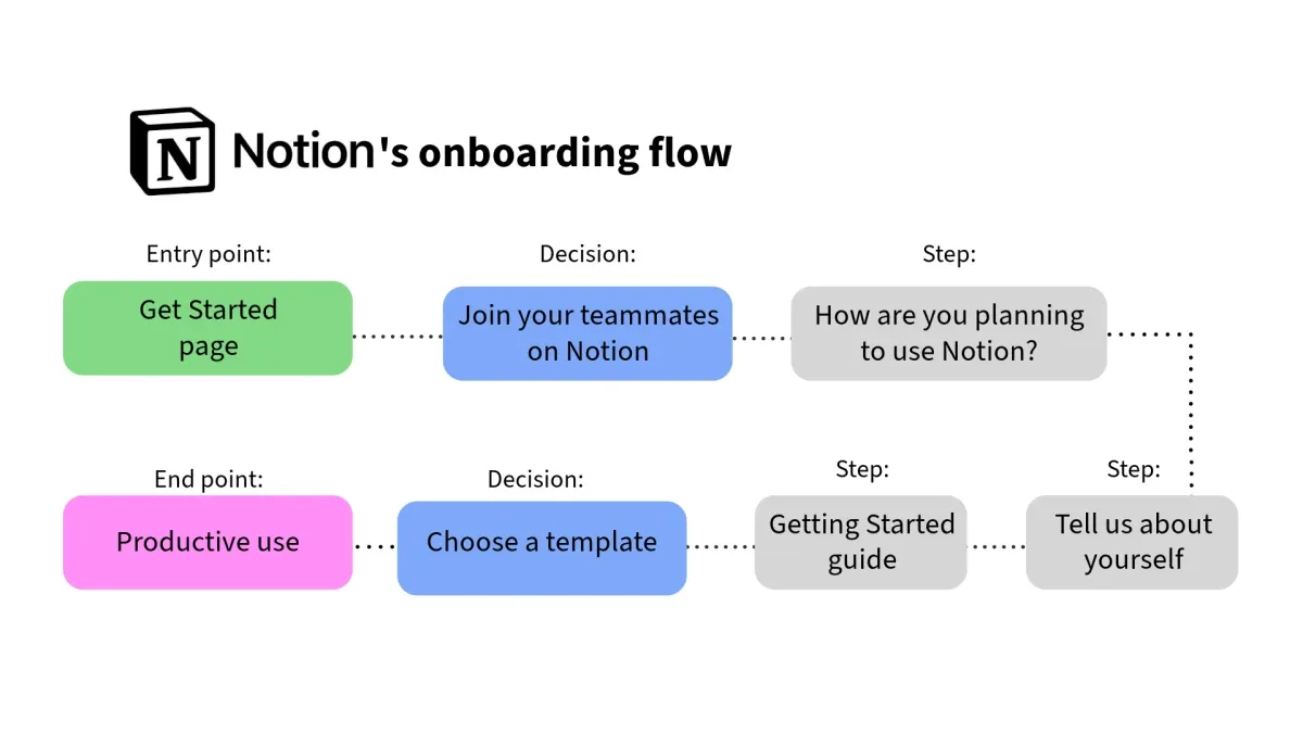
- Entry point: Get Started page
- Users have the option to create a new account with their email address or to use an existing Google or Apple account to sign in, which gives people the ability to get started quickly and minimize future pain points.
- Decision: Join your teammates on Notion
- If other workspaces are detected from your organization, you’re given the opportunity to join their space or continue to create your own.
- Step 1: How are you planning to use Notion?
- You’re asked to tell them if you’re using Notion for your team, for personal use, or for school. This helps them to craft the right onboarding experience for you.
- Step 2: Tell us about yourself
- If you said that you’re using Notion for your team, you’re given the following prompts to continue shaping your experience:
- What kind of work you do, your role, the size of your company, and what you’re planning to do in Notion
- If you said that you’re using Notion for your team, you’re given the following prompts to continue shaping your experience:
- Step 3: Getting Started guide
- Now that you’re officially on the platform, you get an overview of the key features and functionalities that Notion offers. These are displayed as an interactive checklist that not only serves as a guide to onboarding but also as an opportunity to dive right into actively figuring out how the platform works through doing.
- There are also several other sample pages on the sidebar to give you a taste of what you can do in Notion.
- Decision: Choose a template
- The last step on the checklist encourages you do search through the Templates in the sidebar. There will be suggestions at the top of the list, based on the questions you answered earlier in onboarding.
- End point: Productive use
- Now you’re fully ramped up and ready to begin customizing your workspace to your needs. If you ever need help, the question mark in the bottom right corner is there to connect you with resources or the support team.
Optimizing user flows for conversion and retention
The SaaS companies that will cut through the hundreds of competitors out there are those that take a strategic, intent-focused approach to creating user flows.
But intent has two elements.
Highly specific persona research
The best way to start on this mission is to make sure that you’re basing your decisions on thorough user persona research. And like we said, don’t make this broad. Once you have your personas, map their needs, challenges, and goals to specific touchpoints in the journey.
There are several ways you can do this. Good old-fashioned surveys or focus groups are always a good idea. But you can also dig into the first-party data you grab from your platform metrics.
And of course, we can’t ignore the possibilities that AI introduces to persona research. Using AI can help you sidestep many of the most tedious aspects of collecting feedback from your users.
Go further with proactive user intent
Armed with this deep knowledge, you want to make pain points less relevant to the user flow they’re in and play up the parts that are really delivering what they care about.
Things like product tours, AI-powered assistance, and easy-to-follow checklists help you stay one step ahead of what your users need and expect in the flow they’re currently going through.
That’s because you get natural language data which gives you insight into the mindset, frustrations, and aspirations of your users – all in their own words.
This is how you create user flows that truly flow.
