


If you've ever started an online course, tried to journal every day or told yourself you'd definitely meditating daily, you know most behaviors aren't sticky.
It's hard to build a new habit for yourself—and even harder to build a new habit for others. But if you can turn using your app into a habit, users will return by themselves (and without any cajoling).
Stickiness is one of the most important attributes of a SaaS app development and its onboarding process. Stickiness is a measure of how many users are returning to your product either habitually or contractually after onboarding. Stickiness is a major driver of long-term success; a product with successful user acquisition but poor stickiness may fair worse than a less popular product with stellar stickiness.
In other words, stickiness makes the work of acquiring new users worth it. A product with bad stickiness could make money, but that revenue will struggle to scale as the product ages and the retention rate will suffer.
Additionally, stickiness is crucial to building a strong brand culture which will pay dividends over time. Conversely, a product that isn’t sticky will generate negative word-of-mouth (e.g. “tried X, but couldn’t get into it”), which can endanger future prospects.
Onboarding, and resulting stickiness, is one of the hardest problems in SaaS products because it goes beyond the product’s value proposition and delves into a product’s design, language, and feel. A product can provide an important service, but poor stickiness won’t help users kick their older, worse habits.
What is Stickiness (or the two types of Stickiness)?
Practically, there are two independent horizons to evaluate stickiness on. First is a shorter, UX design-focused horizon centers around usage, typically measured in days, of newer users. The second is a longer horizon that evaluates churn when contracts are up for renewal.
These two definitions of stickiness are very different problems. Let’s discuss two conflating examples. Think about stickiness of a productivity app—it should be measured around users returning week after week to manage their team. Then think about a security app that runs silently in the background—its stickiness should be evaluated on a multi-year horizon.
This article will strictly focus on the former category—stickiness defined in the short term. This type of stickiness, sometimes referred to as Product Adoption, can be improved by various strategies and tools designed to encourage newer users. These tools often are branded as onboarding tools (onboarding is the process through which users adopt your product immediately after signing up for an account), but sometimes retain value across all stages of a customer’s lifecycle.
Some Tool-less Tips for Stickiness
There are some general learnings that are worth applying to your product before considering third-party tooling.
The biggest is familiarity. As the web matured, users spent less and less time on a single product, often bouncing between apps. Yes, attempts to create a single UI pattern (e.g. Material Design) have had limited growth, but SaaS products nevertheless strive and should strive to be more familiar and less unique.
Originality in UI design is often not a good thing. Layouts (headers, sidebars, etc.) should have a familiar feel. Buttons and links should be signposted clearly. Your app should avoid weird, confusing widgets that can frustrate the user even if they are—technically—more efficient. Efficiency, in general, is often the reason that apps stray from standard designs, but those non-conventional layouts, while hypothetically improved, will fall flat unless the user develops a strong understanding of how to use them.
Another topic surrounding tool-less strategies to foster stickiness is customer touch. If your app goes through a sales process, then you should volunteer someone’s time to show them around the product and walk them through the paths. Better yet, have the user walk through the paths themselves and steer them over a call. For self-serve products, a hands-off onboarding product tour might not be possible.
Six Types of Tools to Drive User Stickiness
A tracking tool — Posthog
Competitors include Amplitude, Mixpanel, and Heap.
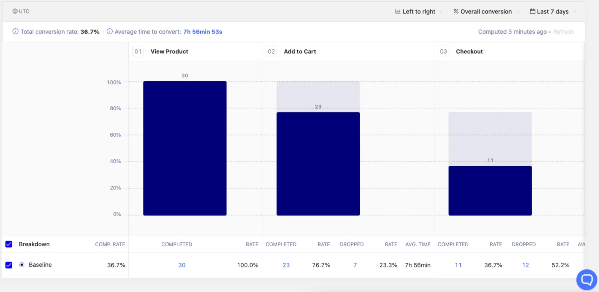
The first thing to install in order to drive user stickiness is a tool to measure stickiness! You need to track how often users return, when and how they drop off, and what are some driving behavior that fosters recurring use. Generalized tools like Google Analytics rarely cut it; you need to implement a solution that doesn’t just measure page views but specifically what actions your users engaged with.
Products like Posthog enable you to easily track user sessions automatically by calling a script that registers the user’s email address and follows their behavior afterward. Posthog is an open-source leader in the space—other tools like Amplitude, Mixpanel, and Heap offer similar functionality.
It’s important for products like Posthog to be implemented correctly; you don’t want to risk evaluating false signals, especially reports of user drop-off when they’ve been active on your product.
More importantly, logging in to your product doesn’t necessarily constitute stickiness. Your users need to actually take meaningful actions in your product to be properly engaged—you should track users that engage with core features and determine what some things they did to get there were.
A Push Solution — Command AI
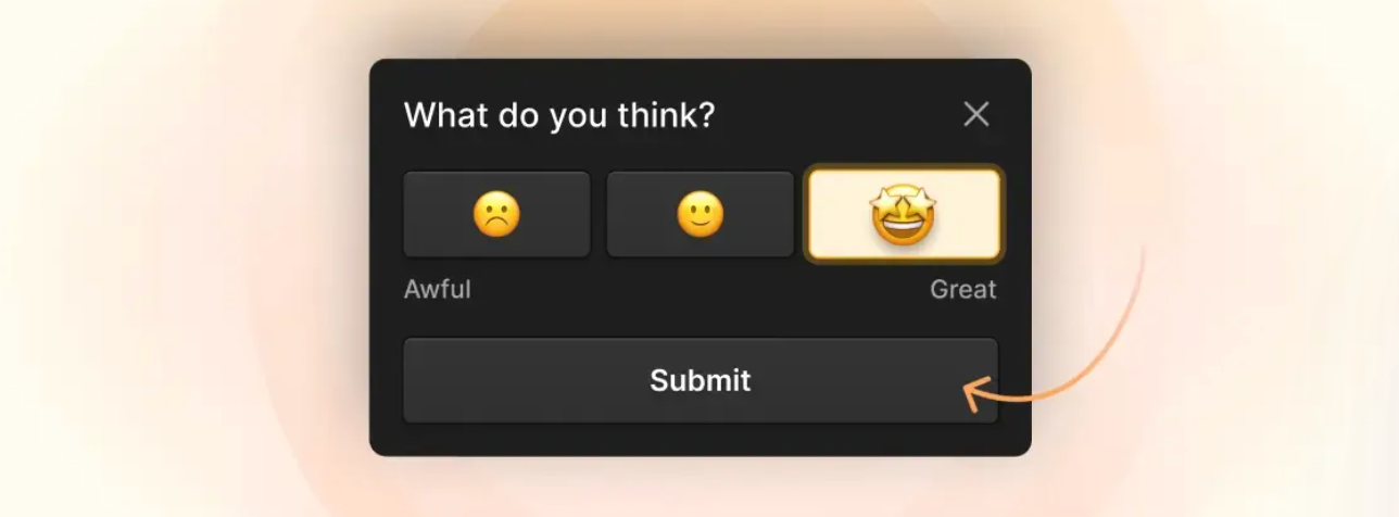
Have you ever logged into a product only to be greeted by a walkthrough tour that inhibits you from exploring? Of course you have. While a poor product experience for some user personas, in-app tours can help show users how a product works, reducing the mental strain users need to figure it out by themselves.
In-app tours can utilize pop-up modals, tooltips, and slide-outs to steer users toward ideal actions and stories. Sometimes they use checklists or progress bars to communicate steps. We call these push strategies because they interrupt the user's flow to push them towards happier paths.
A simple tooltip can be built quickly in Command AI
However, an overbearing tour can frustrate users—stickiness sometimes needs to be fostered over time, not forced upon a user. You want to avoid infantilizing users. Additionally, relying strictly on in-app tours makes stickiness depend on a user’s first few minutes in the product.
Regardless, products like Nudges from Command AI can dramatically improve conversion rates by encouraging users to understand how a product works before diving in. After all, comprehension is the ultimate goal of user onboarding!
A Pull Solution — Command AI
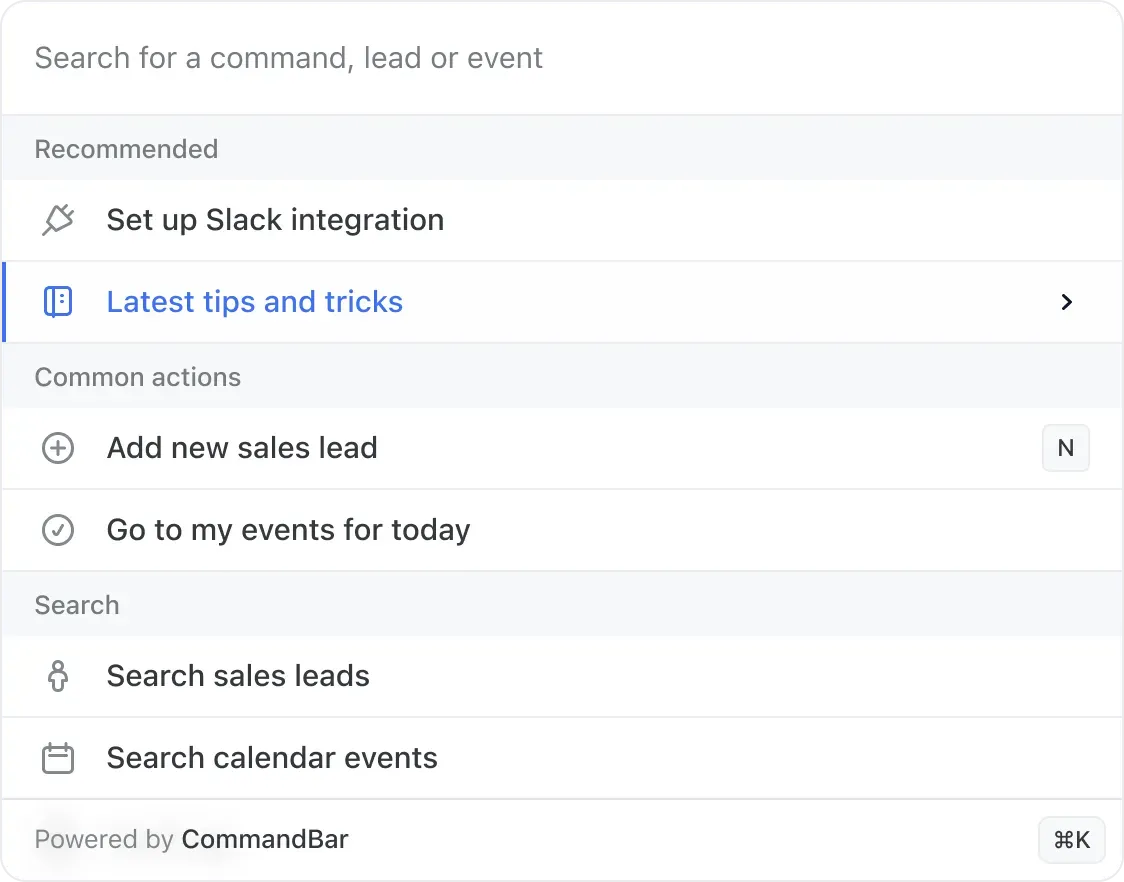
Because push strategies can be overbearing, a pull solution like Command AI can dramatically help users understand a product. Unlike Appcues, which interrupts the user’s flow, Command AI invites users to solve their own questions by searching for them via a command palette.
Command AI exposes both actions you can do (informing the user) alongside help content that may point them in the right direction. Ideally, users shouldn’t have to leave the tab to google their question—if they can do it within the app, they are more likely to graduate to being active users.
Command AI specifically surfaces the most likely action based on the page’s context—this helps tell users both (a) what features they have at their disposal and (b) what this page is typically used for. As a bonus, you can integrate Appcues with Command AI to fire off a user onboarding experience even after a user has “onboarded.”
Command AI does deploy some push functionality, specifically nudges to remind a user about a feature or encourage them to utilize a Command AI action on a certain page. However, these nudges shouldn’t ever be overbearing since they don’t interrupt or derail the customer’s actions.
Another great way to allow your users to pull information out of the product is by offering a user assistant like our Copilot.
This sits in the bottom right corner, but unlike a boring traditional chatbot, Copilot is trained on all of your help documentation to answer questions AND can even launch product tours and co-browse with users for better in-product experiences. Here's a product tour which can be built to launch from Copilot directly.
This is a great way to not only flex support tickets and save your team time, but also to delight your users and improve the overall product experience. Plus, as you go through your Copilot dashboard and also view dead ends where users don't get the answers they need and have to connect to an agent, you'll learn where you can improve your docs and your product.
A Help Content solution — Zendesk
Competitors include Help Scout and Intercom Support.
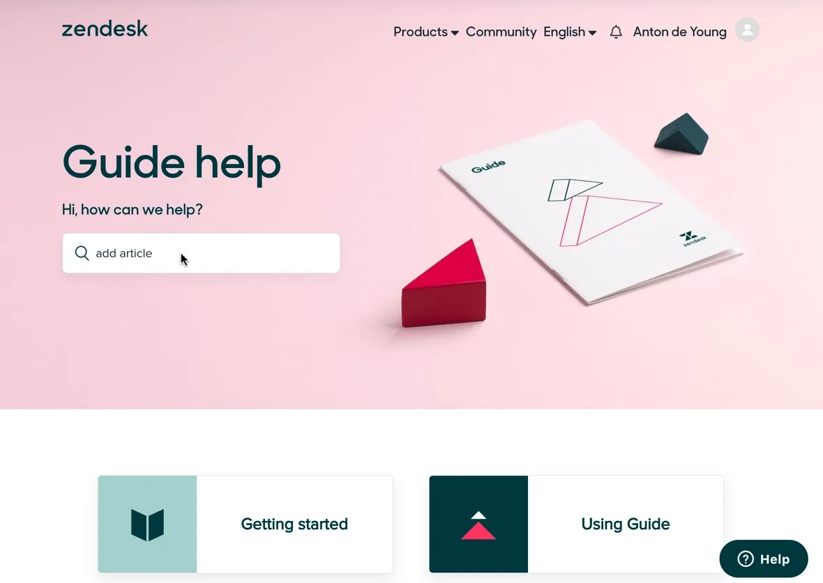
By creating a forum and/or documentation on how to use your product, you’ll strongly encourage your most savvy users to find solutions to their own problems. Oftentimes, users that search and solve their own problems are more likely to be active, creative users of your product (the same could also be said of Command AI’s benefits).
One of the issues with Help Content, however, is search. Your language for describing certain features and actions in your product may differ from your user’s internal language. Sometimes, they may search for a feature that you have but struggle to find it.
While you can technically include synonyms directly in Command AI to fix this, another simple solution is to include keywords throughout posts to include relevant synonyms. The last thing you want is for your existing help content to go unused because a user couldn’t find their aha moment.
An Icon Library — Font Awesome
Competitors include The Noun Project
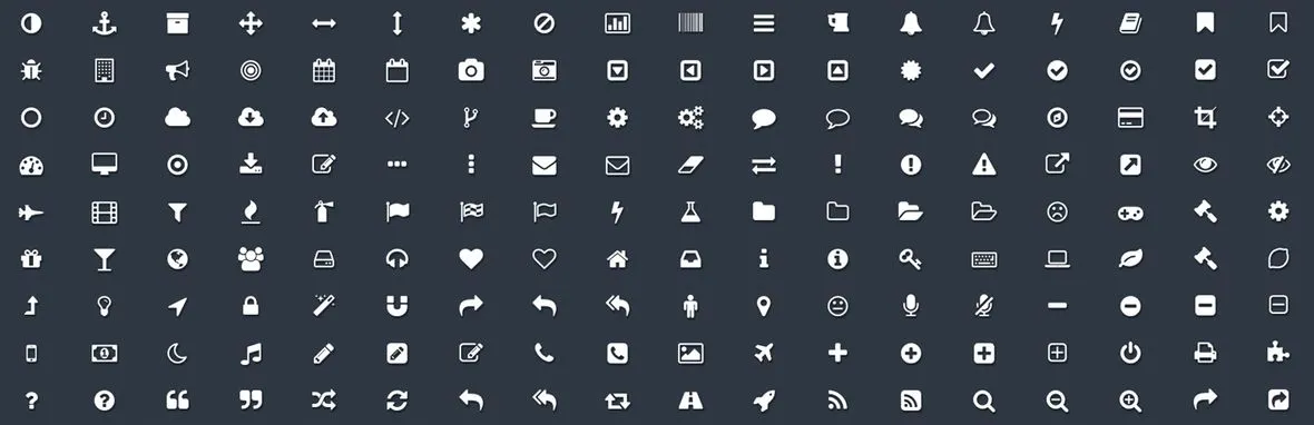
Believe it or not, but your icons could play a big role in user stickiness! Icons are visual queues to guide users to find the right feature relevant to them. Whether you call it remove or close, a trash icon has a clear purpose. Complex but similar things such as Team Management or Workspace Settings should have a shared icon (three user silhouettes huddled together).
However, creating a custom icon set can be difficult. Even if you have some fancy icons on your marketing site, you probably want more clear-cut icons inside your app. That’s where icon libraries like Font Awesome or the Noun Project could help you visually build on top of existing standards. Even if you don’t use the precise same icons, they can serve as a visual reference. It’s worth noting that some libraries, including Font Awesome, may have such widespread use that the icons have grown over-used. If you're looking for more than just icons, you can consider using a UI design service.
An In-App Engagement Tool — Cohere
Competitors include Intercom and Drift
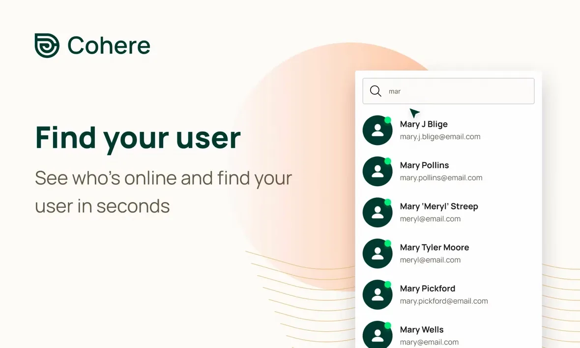
Engaging users when they sign-up could dramatically improve adoption, especially if they are encouraged to ask questions to clear up any confusion. Products like Cohere enable your team to invite users to audio chat + screen share from within your product itself. Technically, Cohere isn’t utilizing the screen share API but rather the same technology that Fullstory or Posthog use for session replay. With Cohere, you can answer questions, draw on the user's screen, and point them to relevant UI components—all things that can contribute to a successful user onboarding experience.
If a product like Cohere feels too high touch, you can instead implement a product like Intercom or Drift to engage users via a chatbot, with your team taking over if the user decides to engage.
Conclusion
A mix of products can dramatically improve your app’s onboarding process and stickiness. By correctly leveraging the right tools, you will drive more predictable revenue and make a better return on go-to-market investments to acquire newer users. As a bonus, you’ll generate a stronger brand that’ll translate to some complimentary word-by-mouth marketing.
The most important thing to consider is that your user onboarding process is utilized but not overbearing. Forcing users down paths designed to latch them onto the product can irritate them. A gentler, user-friendly approach is more likely to render better results. For more, check out these examples of stellar user onboarding.