It feels like you can't sign up to an app nowadays without being bombarded with pop-ups.
"Take this 20-step tour"
"Got some feedback?"
"3/12 onboarding steps complete"
If you're like me (and probably most of your users), you instantly close all of these popups.
But as soon as we take off our user hat and put on our PM hat, we LOVE popups. User engagement issues? Build a tour! New feature? Announcement popup!
As users, we hate popups. As product people, we love them.
What gives? When used appropriately and effectively, in-app messaging can be used throughout the customer journey (not just during user onboarding!) to drive customer loyalty and improve customer retention. But when mindlessly thrown at users, in-app messaging can feel like a spammy pop-up message that instantly triggers the user's "escape" or "x out" instinct. The difference between good and bad in-app messaging is staggering, especially for younger products: redesigning your in-app messaging strategy can yield a 10x improvement in product adoption rate.
But first things first...
What is in-app messaging?
In-app messaging, or in-product messaging, is any communication between an app and a user that happens inside that app.
Are in-app messages the same as push notifications?
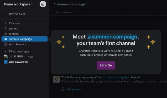
It is very reasonable to wonder how in-app messages differ from push notifications. The crux of it is that in-app messages are only surfaced inside the app, whereas push notifications are surfaced outside the app. Take Slack as an example. An email about a new Slack feature is a push notification. The introductory modal that appears when first creating a workspace (see screenshot below) is an in-app message. Unlike push notifications, in-app messages are guaranteed to catch your user at a time when they are thinking about your product. The main challenge is sending the right message at the right time.
Contents:
- Flavors of in-app messaging
- Pairing in-app messaging and user onboarding
- In-app messaging wisdom
- Final thoughts on in-app messages
Flavors of in-app messaging
Admittedly, the definition of in-app messaging used in the introduction, "any communication between an app and a user," is very broad. To make things a bit more digestible, we can look at the most popular flavors of in-app messaging:
- Modals
- Tooltips
- Product tours
- Surveys
- Chat
Modals: the "vanilla" in-app message
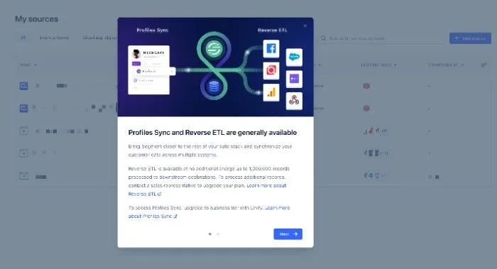
Modals are the "vanilla" of in-app messaging flavors. Two alternate names for modals are "lightbox" and "pop-up." By far the most widespread and generally the most intrusive, in-app modals often dim the rest of the screen and sometimes are un-skippable. SaaS products use modals to communicate important changes.
Since modals are large, it is important that they are visually appealing and visually engaging. There is room for more text than most other forms of in-app messaging, but you should still use concise language. Modals are usually only one "step" (no next button) but can be multi-step, like in the example below.
These are some common examples of modals:
- Inform users of new features or product updates
- Encourage the user to upgrade their account
- Nudge an admin to invite a teammate
- Acknowledge a change in terms or user agreement
Tooltips: the specific in-app message
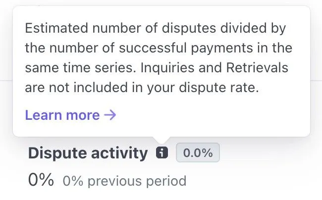
Tooltips are generally smaller and communicate more specific points to a user. Tooltips are often "pinned" or "anchored" to a specific element in a product, like a button. When that button is clicked or hovered over, the tooltip emerges to communicate relevant information to the user. Tooltips are a great example of contextual messages: they only display in certain parts of a product (the button the tooltip is anchored to) at specific times (on click or hover).
The most common use case for tooltips is the "informational hover." The informational hover explains the related feature when the user hovers over an "i" or "?" icon.
Product tours: combining modals + tooltips to engage users
Product tours, also called "user guides," are a multi-step combination of modals and tooltips that prompt users to explore the core functionality of a product. Product tours are most often used in new user onboarding or to introduce a new feature. At their best, product tours can make your product more accessible for new users, encourage users to learn, introduce new features, and ultimately help users get more value from your product.
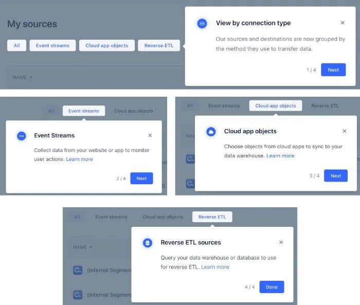
In the user onboarding experience below, Segment uses a chain of 4 tooltip modals to explain the various options for one of their features. The product tour is only triggered when the user is the relevant part of the app and uses short, simple messages to increase the odds of user interaction.
Surveys: the request for user feedback
Surveys are a special case of modals that solicits user feedback. The three general types of surveys are:
- Text (e.g., "What do you like most about our product?")
- Numeric (e.g., "How likely are you to recommend our product?")
- Select (e.g., "Which of these feature(s) did you find valuable?")
Those new to surveys see them as a perfect tool to get customer feedback and drop surveys in the app willy-nilly. If you studied any product, you would see that users respond to fewer surveys as they are asked to complete more. To level set, you should also know that most of your users will ignore all surveys. The more experienced survey creator understands that there is only so much "capital" a product has with a given user and must deploy that capital on surveys somewhat cautiously. This might paint a sad picture, but in-app surveys are still an incredible tool for listening to the voice of your customer base.
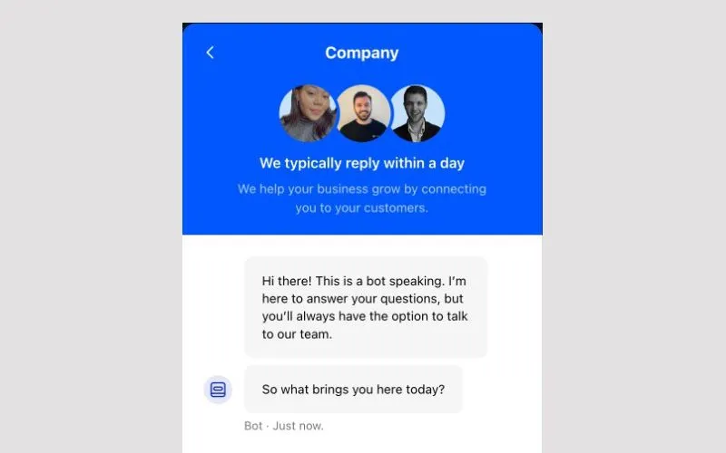
Chat: as close to phone call support as most products get
Without chat, users can only ask questions or share feedback either by emailing the team or hopping on a call with a representative. Neither are particularly attractive options. Calls, great for customers, and emails, easier for companies to handle, represent the two extremes of customer interactions:
- Responsiveness: calls – immediate; email – slow
- Engagement: calls – very engaging; email – static
- Cost (personnel and time): calls – high cost; email – low cost
For most companies, call support is infeasible. It just takes too many people and too much time. Emails are also not always the best option either. Slow responses to questions can kill the experience of first-time users. In-app chat is a middle ground that offers one advantage that even calls don't: users can open chat nearly instantly whenever they want to use it and can dismiss it once they have what they're looking for. If your product offers chat, you should strive to meet a specific "service level agreement" (SLA). Customers can be frustrated when they expect a response in minutes but don't see anything for a few hours.
Pairing in-app messaging and user onboarding
As noted earlier, in-app messaging can be extremely effective when paired with user onboarding. User onboarding is arguably the most important product tool for increasing user retention. Helping users unlock value in their early experiences plays a major role in the user's decision to adopt your product or churn.
Each of the in-app messaging flavors mentioned above should be used in an effective and complete user onboarding strategy. It takes some thought to intelligently use each, but the variety will improve the customer experience and help retain users.
Modals in user onboarding
Modals will probably be your go-to form factor. Modals are perfect for a welcome message, feature announcements, and highlighting critical onboarding steps.
The main caution is to avoid overusing modals. Since they are usually large, they can start to feel like pop-ups if they are shown too frequently or if they are being used at inopportune moments. Consider the user's context (where they are in your product, what they have done, what they have not yet done, etc.) before serving them a modal. For example, using modals to communicate bug fixes is probably too much.
Tooltips in user onboarding
Tooltips are a great accent to more complex functionality. Anywhere in your product that drives customer confusion is a good candidate for a tooltip. New users rarely understand the ins and outs of your product and are the most likely to be confused by product-specific terminology.
Hover tooltips enable new users to enjoy an "opt-in" experience, where users can engage with tooltips as needed. These are pretty safely deployed because their purpose is very clear, and they are used as needed.
Trigger-based tooltips, the ones that open programmatically based on a certain "trigger" action (e.g., a user visiting a specific page), should be more carefully deployed. Unlike hover tooltips, trigger-based tooltips do not communicate to the user why they're being shown. Poorly timed or placed trigger-based tooltips are likely to be closed immediately by users.
Product tours in user onboarding
Product tours are the cream of the crop for user onboarding. The main question is deciding what types of product tours to build.
Consider your product's "aha" moments, and work back from there. What are the easiest and most natural ways to help users understand your product's core value? Baking product tours like these into the onboarding process helps level up your user base. They're the perfect way to introduce users to important features as well as any new functionality.
Surveys in user onboarding
Surveys might seem like a bizarre fit for user onboarding. After all, isn't the point of user onboarding to help users navigate your product? Surveys can be used in a few different ways that can drastically improve the early app experience.
- Improve the product: User input on your product can reveal what is working and what is not. More specifically, feedback during onboarding can help your team understand where early users are confused and why. Equipped with this information, your team can take specific actions to improve your product.
- Engage users: Many products do not prompt users for their opinions in-app. One simple differentiation is just providing users with an avenue for sharing their thoughts. Doing so earnestly is a great way to engage your users and make them feel like their opinions matter (because they do!). Engaged users are more likely to complete onboarding flows and explore your product.
- Personalize user onboarding: An attentive team is able to take a user's survey responses and use it to either programmatically or manually personalize their onboarding experience. Whether sending personalized messages or scheduling 1:1 calls, highly personalized onboarding is a great strategy for improving activation rates.
Chat + user onboarding
Chat is a reactive but valuable option for user onboarding. Simply adding chat to your product gives users a way to reach out with questions. If you decide to implement chat, it's important to provide prompt support to users; various studies across industries find that ~80% of users expect a response within 10 minutes.
Chat is also an awesome tool for keeping a pulse on your product. New users often raise pain points and confusion and sometimes reveal surprising user behavior. This is a great source for bug reports and product improvements. Great companies combine this input with survey responses to enable "happy paths," like onboarding guides for common flows or templates for getting started.
In-app messaging wisdom
The 3 "do"s below help generalize wisdom around in-app messaging.
Do #1: Use in-app messages
At this point in the article, this should go without saying: use in-app messages! Regardless of the use cases you are considering, in-app messages almost certainly have some way to help. If no modal, tooltip, product tour, survey, or chat experience can assist your product, then either your product is doing something truly innovative, or you are missing some major customer insights. Adding an introductory modal or NPS (net promoter score) survey is an easy way to get your feet wet. Once you see the impact, either on impressions or responses, you will likely be inspired to go deeper.
Do #2: Contextualize in-app messages
Contextualizing in-app messages is an excellent way to personalize in-app experiences. Think about it this way: some users, while outside your product, receive push notifications and engage with the message or execute the "call to action" (CTA). When you present nudges, tooltips, surveys, etc. in the right places in the app, while your product is top of mind for a user, engagement will be much higher.
Basic levels of contextualization go a long way in making a product feel more mature and sophisticated. These are a few dimensions (beyond the user's first name) that can be easily used to contextualize messages in a meaningful way:
- Location: where the user is in your product
- History: what actions a user has taken so far
- Unexplored territory: key functionality that the user has not yet tried
- Current focus: what the user has recently been working on in your product
- Use case: the user's main goal
How can these dimensions influence your messaging strategy? One example is triggering a product tour or product checklist based on the dimensions above, like a use case. Customizing an onboarding flow around a use case, for example, allows you to approach different audiences in a more effective way, showing them the personalized content that they care about.
Do #3: Experiment, analyze, and adjust
Treat your product's in-app messages like a scientist might treat their hypothesis: experiment with various solutions, analyze the results, and adjust as needed to incorporate improvements and implement radically new ideas.
One of the most dangerous things products do is treat in-app messages like a "set and forget" exercise. App developers are sometimes inclined to hard-code their in-app messages in code. While appealing at the point of implementation, this approach can severely limit iteration velocity and, ultimately, the efficacy of the messages since engineering effort will always be required to make a change. This dynamic varies from company to company but is one of the main reasons why so many products use a service provider to manage in-app messages. Service providers generally make it much easier and faster for less-technical teams to make changes.
Final thoughts on in-app messages
In-app messaging is a powerful tool that can greatly enhance the user experience of your SaaS product. By providing timely and relevant messages, you can increase product adoption metrics like engagement, reduce churn, and ultimately drive growth for your business. From modals to product tours to surveys, there are a variety of flavors of in-app messaging that can be tailored to meet the specific needs of your users. By following the in-app messaging best practices outlined in this article, you can create a strategy that turns new users into loyal customers.
