Spotlight analytics
Analyzing Assist experiences is different from analyzing Nudge experiences. Nudges involve creating multiple experiences of the same type to serve discrete purposes. Assist experiences are widgets that users can use in varying different ways.
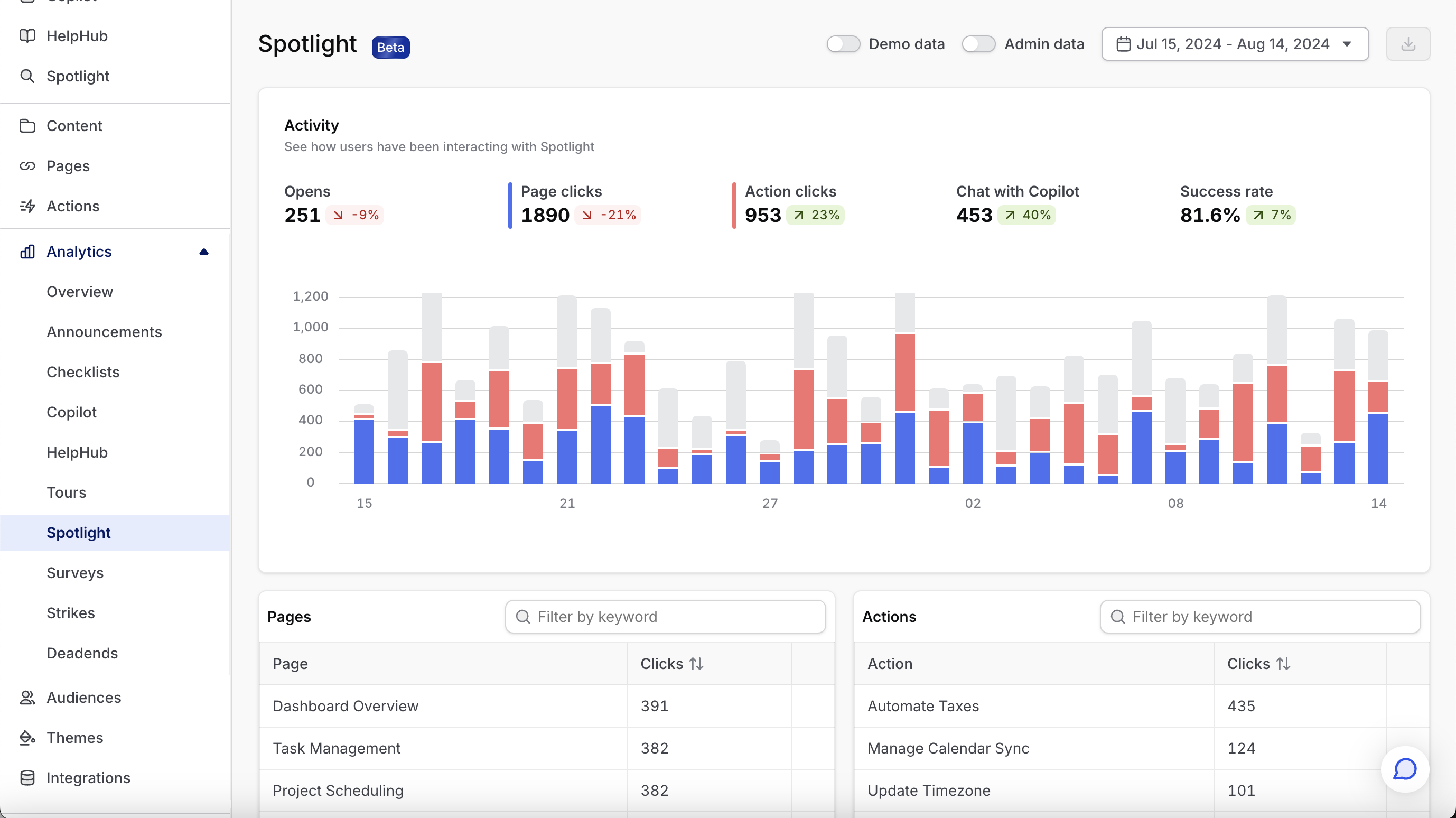
The Spotlight analytics dashboard is designed to help you understand how much users are engaging with it, and what they are primarily using it for.

Activity
The activity chart at the top of the page does a couple things:
- (a) at a glance shows you how much users are using Spotlight and how engagement is trending over your selected period.
- (b) at the highest possible level, what are users using Spotlight for — to open pages or trigger actions
Opens represent any time a user opens Spotlight. From there, the following things can happen:
- They can open a page (either from the default state or after searching)
- They can trigger an action (again, either from the default state or after searching)
- They can do neither of those things. Maybe they just close it. Maybe they search, don’t find what they’re looking for and bail. In any case, we bucket these under
inaction.
In general, the higher the ratio of action to inaction, the better Spotlight is serving your users.
Pages
This table shows the page that are most frequently opened via Spotlight. You can jump directly to edit the page by clicking the three dots icon to the right of the icon. When editing, remember that the page in question may be used in places other than Spotlight.
Actions
This table shows the actions that are most frequently opened via Spotlight. You can jump directly to edit the action by clicking the three dots icon to the right of the icon. When editing, remember that the action may be used in places other than Spotlight.